Services / Branding
A brand identity built for the day I'm not there.not there.
Brand identity design in Cleveland, Ohio, for businesses that need the mark to survive a printer, a sign shop, a part-time marketer and a decade. Not a logo file — the whole system, and the document that explains it.
01 What lands in the hand-off
The folder you get is the real deliverable.deliverable.
A logo is one file. An identity is everything that has to be true for that file to keep working after I have moved on. This is what you actually receive.
- 01
The mark
- Primary logo
- Horizontal and vertical lockups
- The symbol on its own
- Minimum sizes for each, in inches and pixels
- Clear-space rules
- 02
The system
- Colour palette with hex, RGB, CMYK and Pantone
- Typefaces, with what each is for
- Patterns and supporting graphics
- Photography or imagery treatments
- A one-colour and reversed version of everything
- What not to do, shown rather than described
- 03
The files
- Vector masters (SVG, PDF, EPS) in every lockup and colour
- PNG sets sized for web and social
- Favicon and app icon
- Fonts or licensing notes
- Everything named so a printer can find it
- 04
The guide
- A brand guidelines PDF
- Written for the next person, not for me
- Short enough to actually get read
- The document that stands in for a brand manager
02 One brand, start to finish
Arc2FE: a fabricator's mark, drawn to survive a hard hat.a hard hat.
Step 1 · Direction
Four directions, narrowed one conversation at a time.
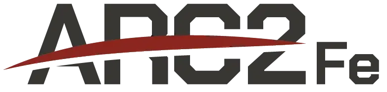
Every identity starts before anything is drawn: a conversation about what the mark has to say about the company. For Arc2FE that was precision, steel, and a crew you would trust on your own site. The first round put four directions on the table — a swoosh under the name, a monogram in a roundel, a stacked block, and an A built from the arc itself. Any of them could have carried the business. Over two rounds of revisions we narrowed to the one that said fabricator most clearly, then refined it until it held at every size.
Step 2 · The system
Three lockups, one shape.
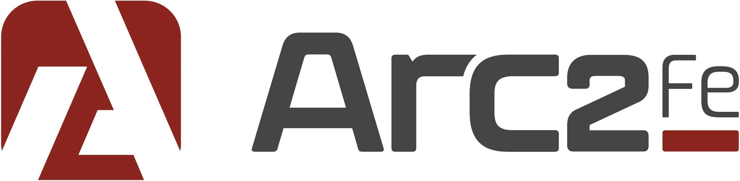
Size and application are part of every identity, not an afterthought: before a mark is finished it gets tested at the sizes and on the surfaces it will actually live on. For Arc2FE the primary runs horizontal. The vertical takes over wherever width runs out, which on a job site is most places: a hat, a chest pocket, a truck door. The symbol alone carries the rest, down to half an inch, because everything eventually gets printed small.



Step 3 · Colour and type
Charcoal, burgundy, steel.
Three colours is deliberate. A shop orders in small runs, and a palette you can hold in your head is one that survives the third vendor. A squared, semi-expanded face for headlines because it reads like something machined; Montserrat underneath because a spec sheet has to be readable at eight point on a photocopy.
- Charcoal Grey#434444
- Burgundy Spice#8B281F
- Steel Grey#939598
- Arc2FeNorthura Bold Semi Expanded · headings
- Cut, welded, deliveredMontserrat · body
Step 4 · Applied
It ends up on a hat.
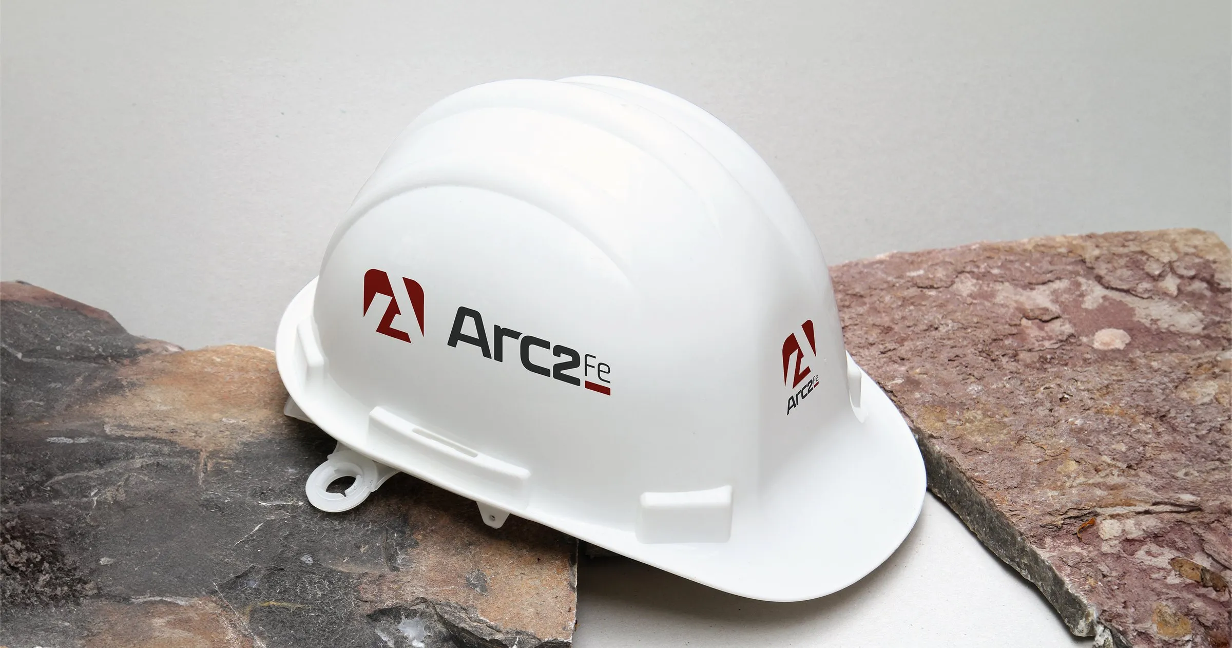
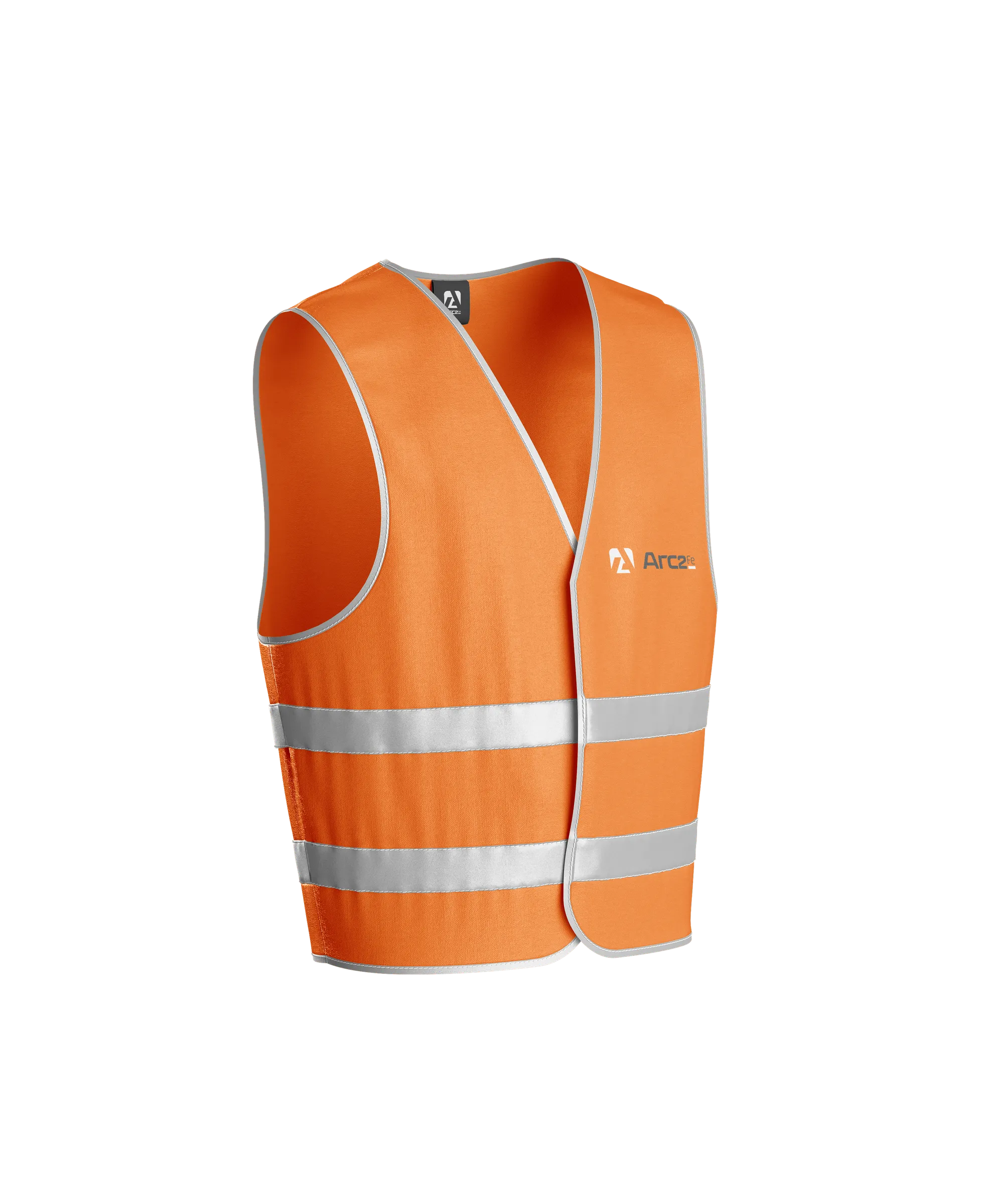
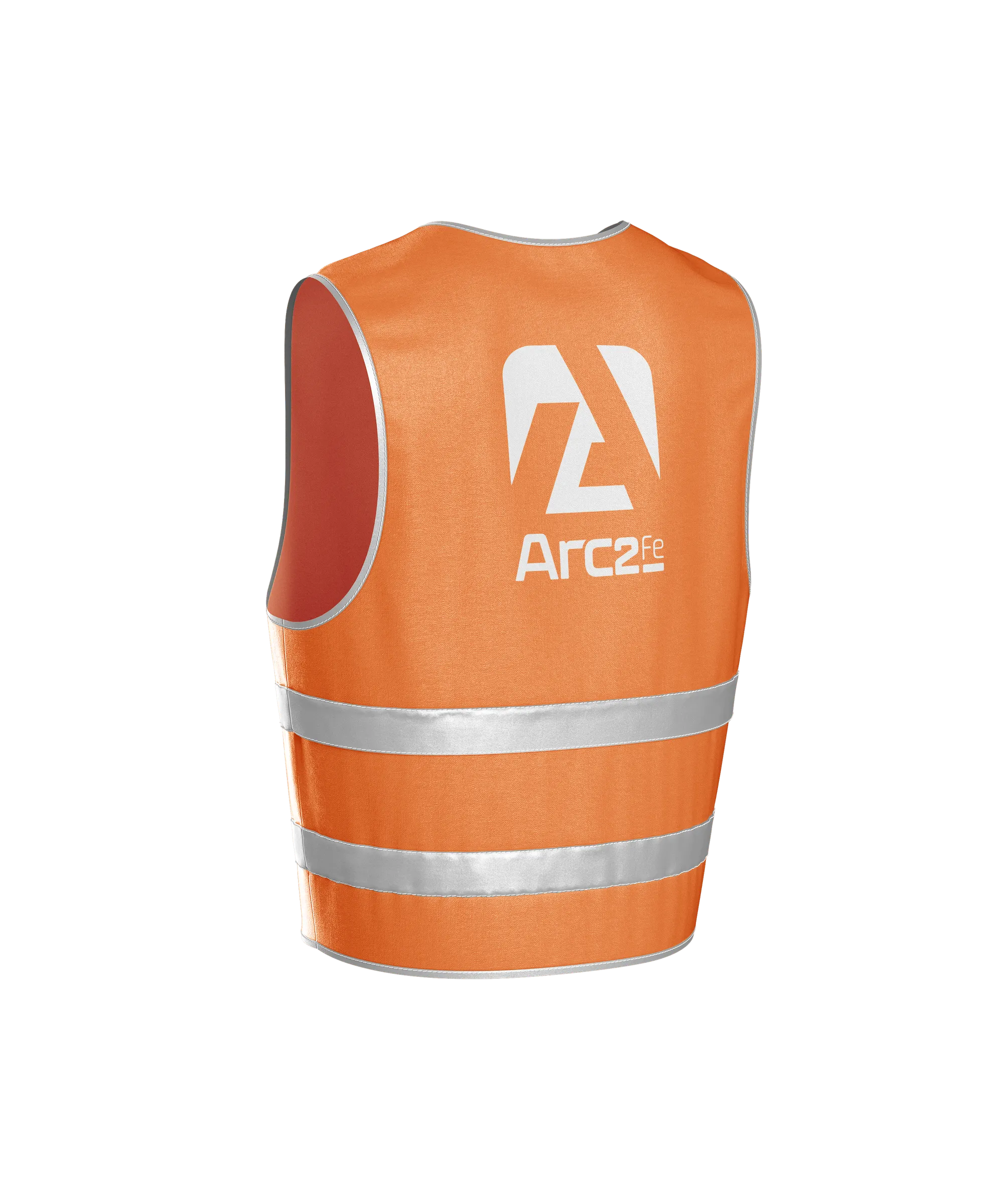
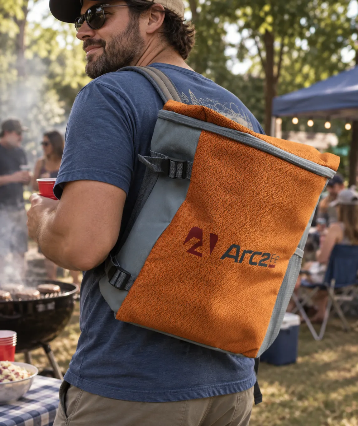
Every decision gets tested the same way: print it small, print it on something orange, print it on something curved. The symbol on the helmet, the vertical lockup across the back of a vest where a foreman can read it across a yard, the horizontal on a bag that leaves the site and turns up at a cookout.
Step 5 · The guide
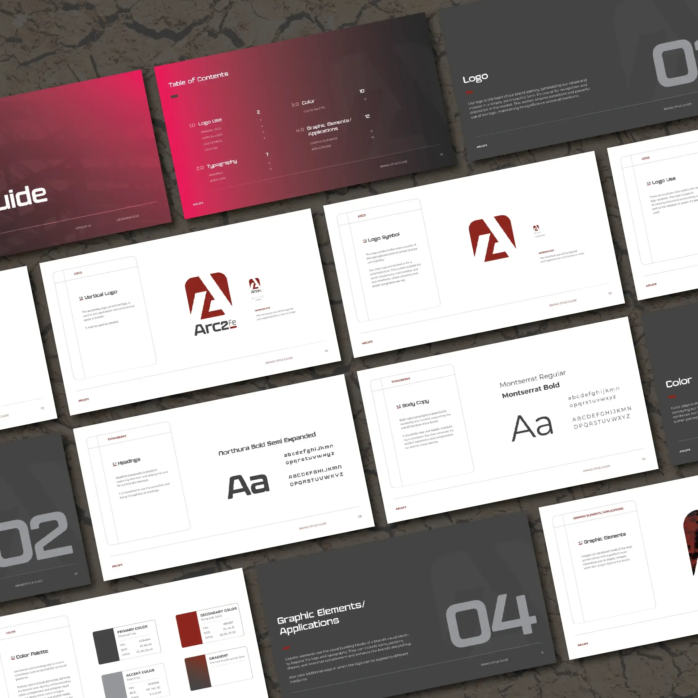
Fourteen pages so nobody has to ask.
Which lockup goes where, the minimum size for each in inches, the hex and CMYK for all three colours, the two typefaces, and the trick where a photo sits inside the symbol. A small shop does not have a brand manager, so the document has to be the brand manager.
04 Before you hire anyone
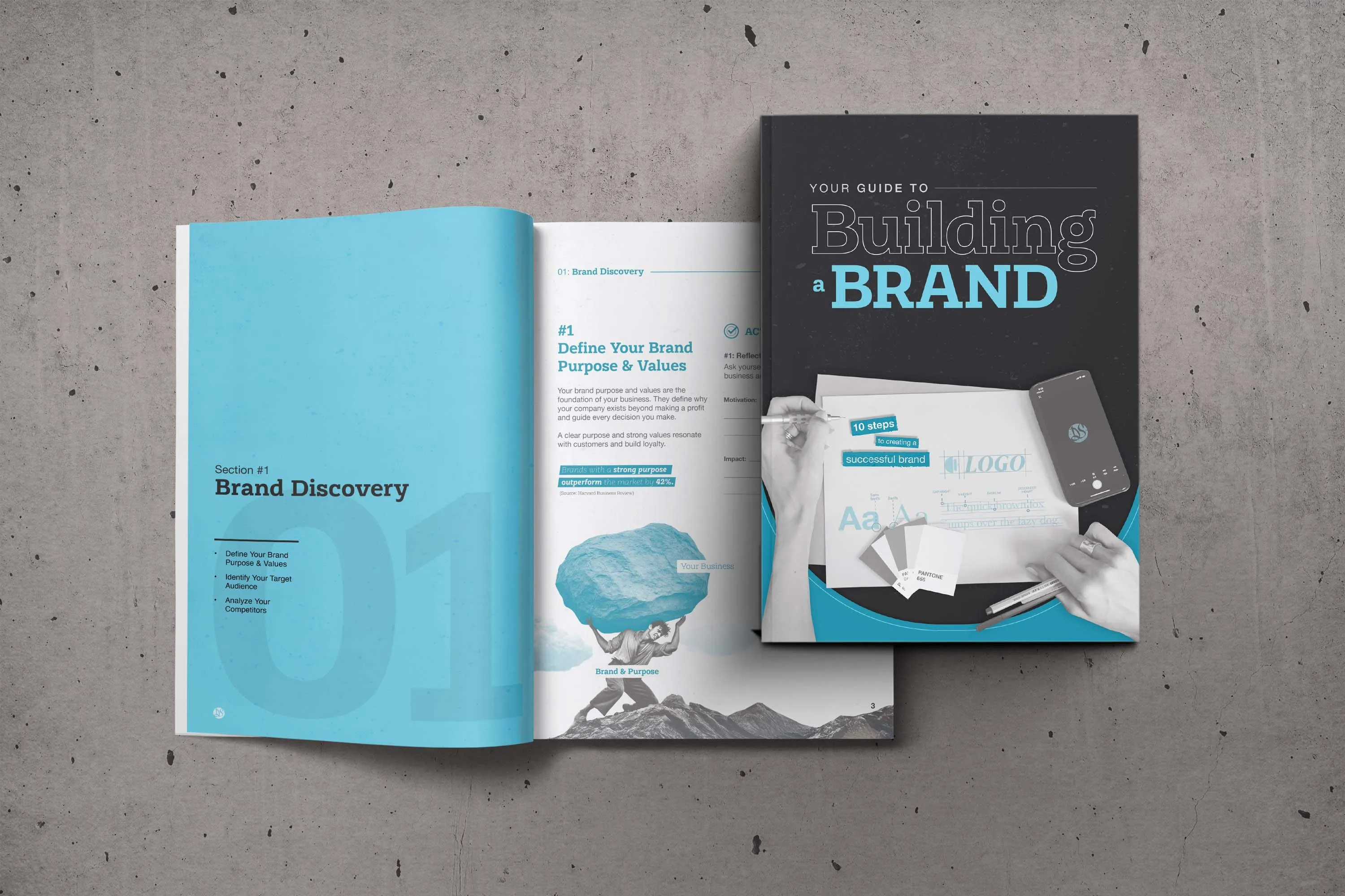
Your guide to Building a Brand.a Brand.
Five sections, from purpose and audience through the mark, the palette and the type, with worksheets at every stage. It is the groundwork every brand needs before any design starts, laid out in order so you can get a head start on your own.
05 In their words
“We've used Danny on multiple branding projects here on the farm and his talent and creativity has always exceeded our expectations.”
“Danny nailed the logo without even one round of revision. He was easy to work with, professional and delivered everything I asked for quicker than I expected.”
“Danny was very professional with his craft. If you want something done personally and professionally, save yourself some time and talk to Danny.”
06 Branding questions
What people ask before they commit.commit.
-
How many logo concepts do I see?
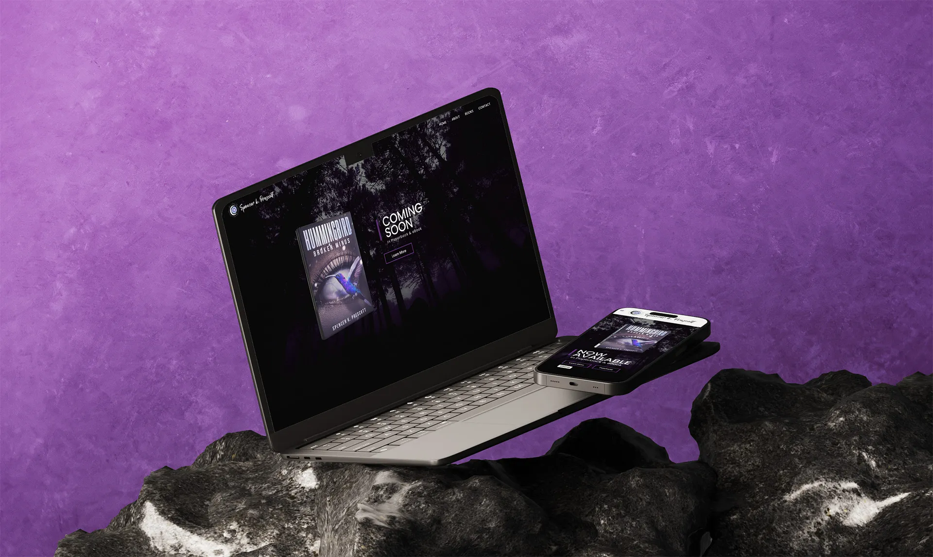
A few genuinely different routes, each argued for honestly, rather than ten variations of one idea. Arc2FE and Spencer K. Prescott each saw four. You pick a direction and we commit to it. The rejected routes are shown on the case studies here on purpose, so you can see what the choice looked like.
-
Do I get the source files?
Yes, all of them, and they are yours. Vector masters in every lockup and colour, web and social PNG sets, favicons, and a guidelines document explaining how to use them. Nothing is held back and nothing needs me in the loop later.
-
We already have a logo. Can you work with it?
Often that is the right call. Realeflow kept its mark and got a refresh of everything around it. If the logo is sound and the problem is what has grown up around it, a refresh costs less and disrupts less than starting over.
-
Is a guidelines document really necessary for a small business?
It is more necessary for a small business, not less. A big company has a brand manager to answer questions; a small one has a document or nothing. Arc2FE is a steel fabricator with no marketing department, and a fourteen-page guide is what keeps a foreman ordering vests and an accountant building a letterhead in the same place.
-
Do you do packaging?
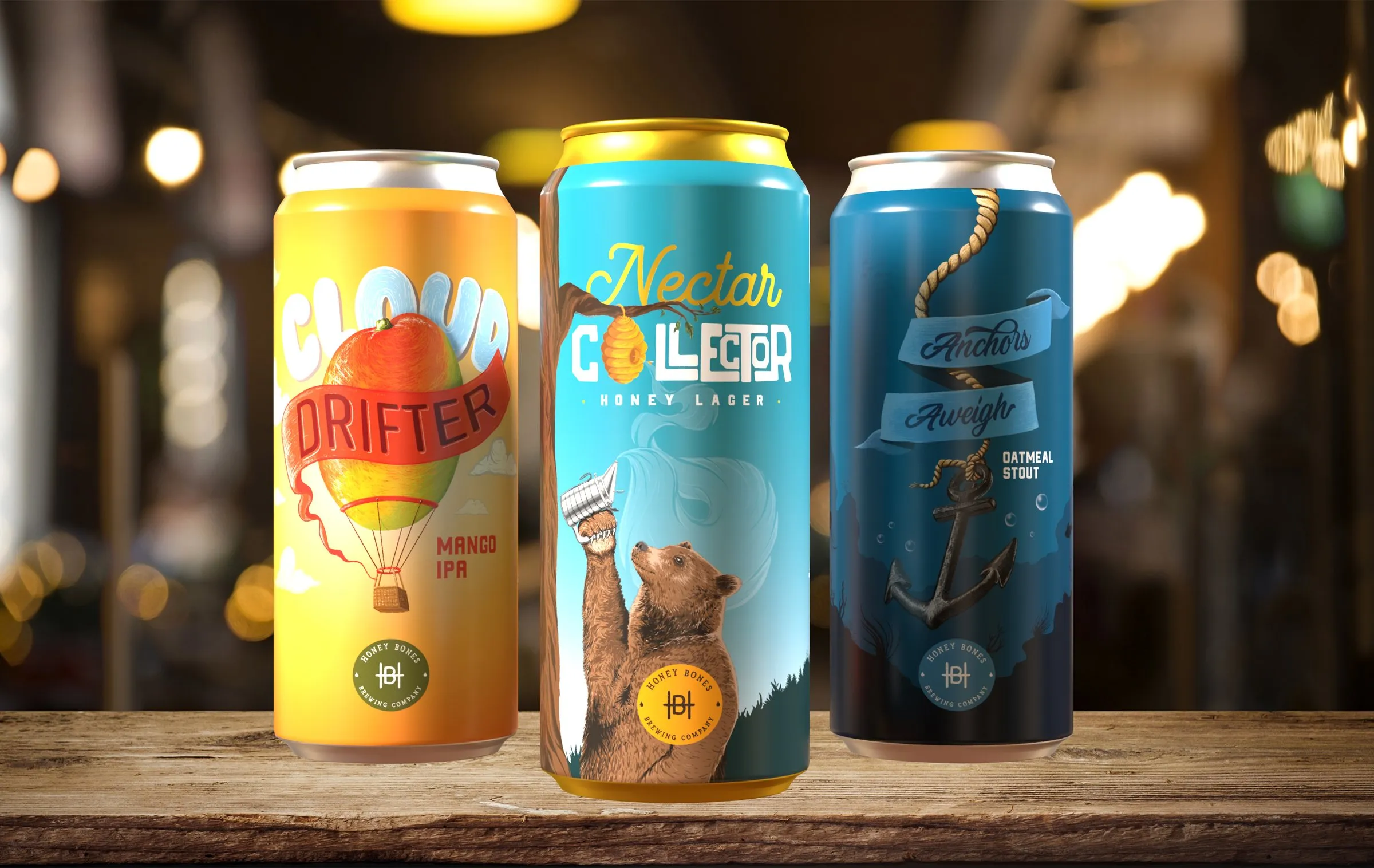
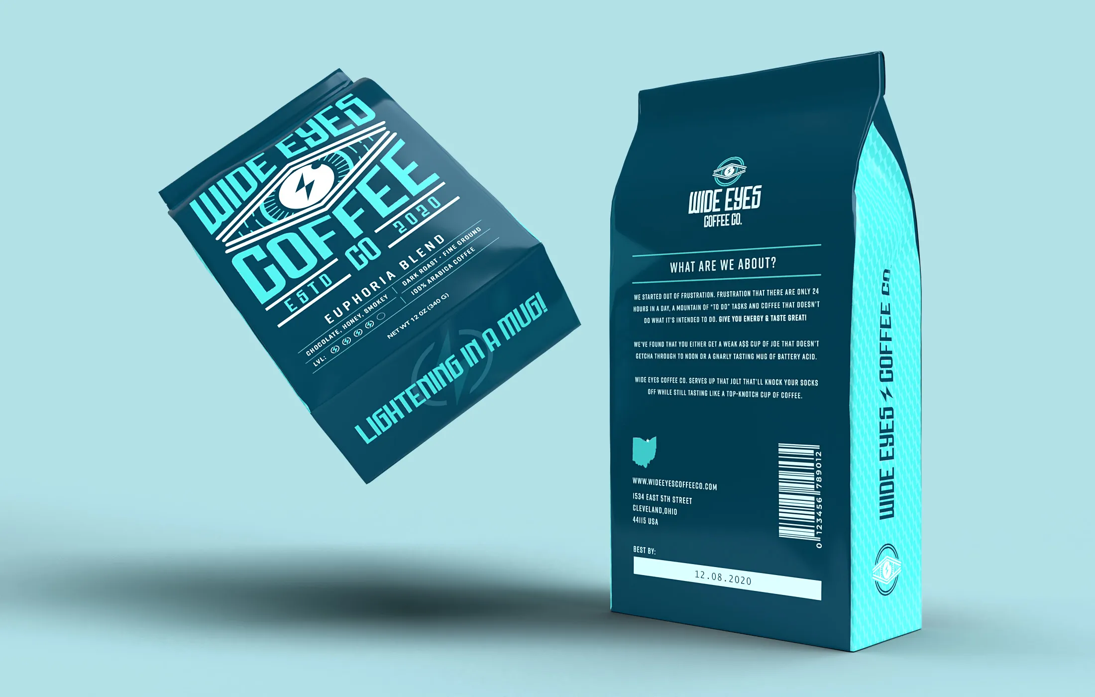
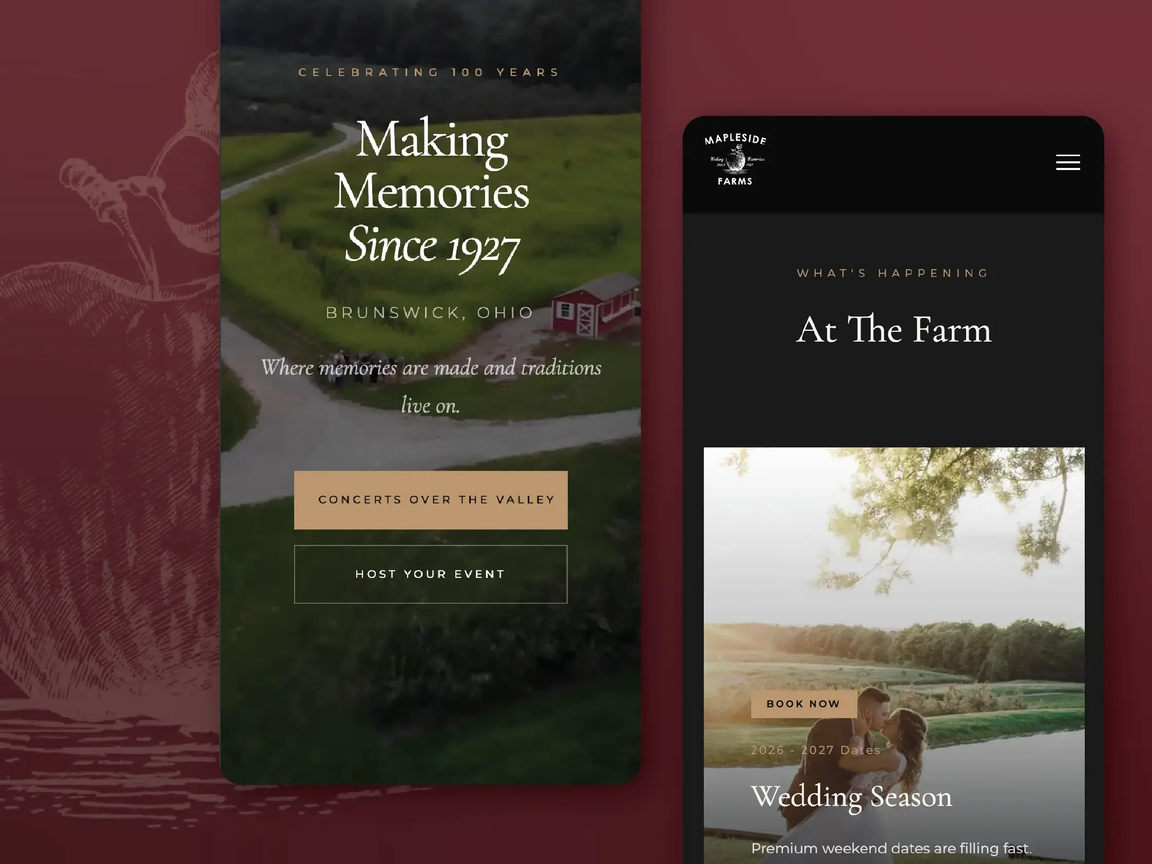
Yes, and it is some of my favourite work: the Honey Bones cans, the Wide Eyes bags, the eight wine labels for the Social House at Mapleside. Packaging is where an identity gets tested at its smallest and its most crowded, so it tends to make the system better.
-
What does branding cost?
It is scoped and quoted as a fixed price once we have talked, because a mark on its own and a full system with packaging are very different jobs. Before design starts you will have a written scope, a fixed price and a timeline you can plan around.
07 Additional services
-
Web design
Sites that look like the brand and move someone a step closer to hiring you.
Explore web designExplore web design -
Motion graphics
The complicated thing, explained in thirty seconds and cut for every placement.
Explore motion graphicsExplore motion graphics
08 Next step
Have a project in mind?mind?
Tell me what you're building and where it's getting stuck. I'll reply personally, usually within a day or two, with a straight answer on fit, timeline and budget.