
Work / Mapleside Farms
A twenty-page site for a hundred-acre farm, and the brand for the room at the middle of it.
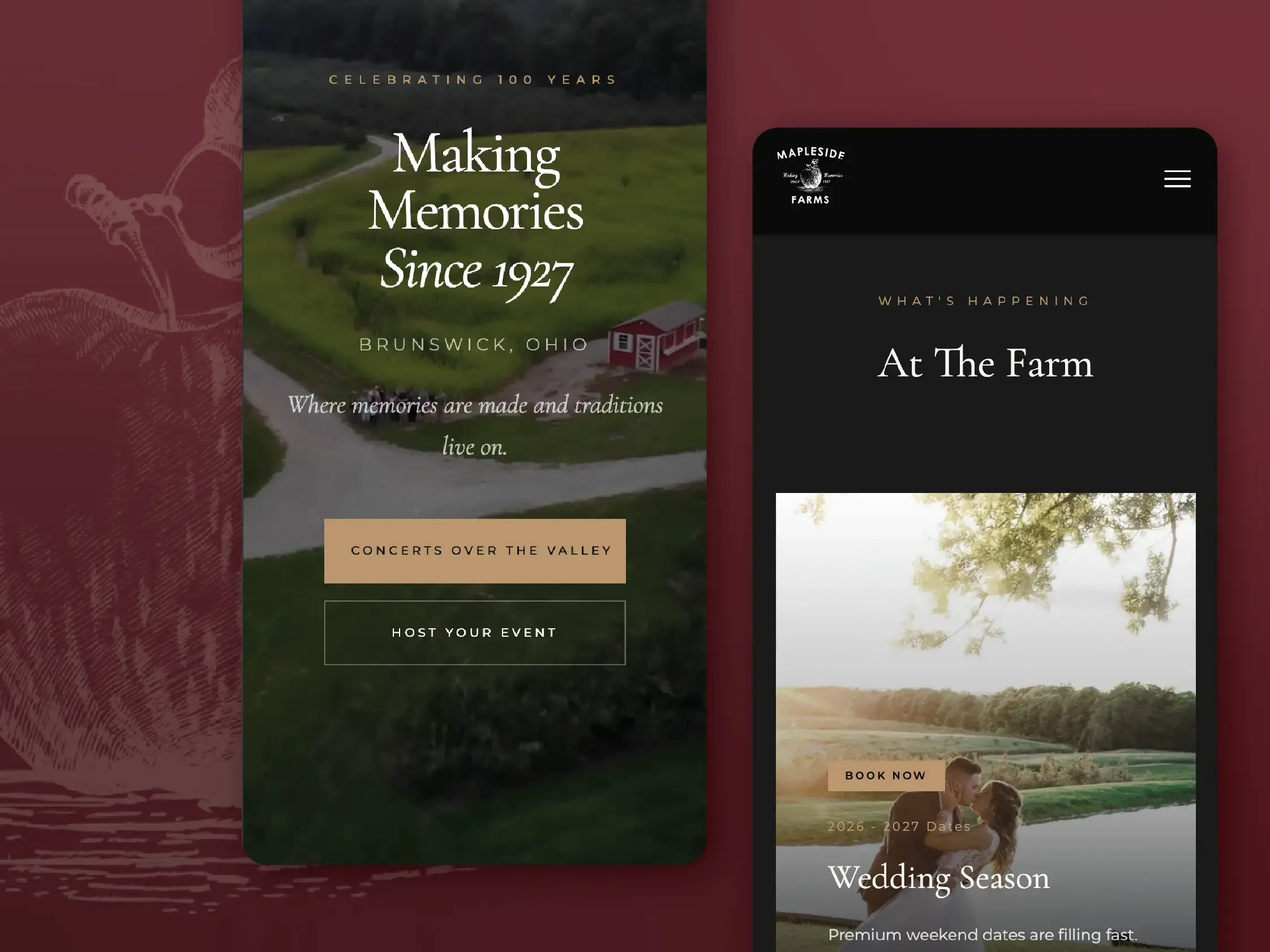
Mapleside Farms hosts hundreds of thousands of visitors a season. I have managed the ongoing design and evolution of its website and digital presence, plus the seasonal advertising, signage, merchandise and promotional materials that keep the experience consistent from billboard to barn.
The farm’s own brand was already in place when I started. The Social House — its restaurant, winery and brewery — is the identity I built around the farm’s own maple leaf: three marks scaled from a storefront down to a coaster, eight wine labels, and the menus that put them all in one place.
01 Website
One farm, a dozen attractions, twenty pages.
Mapleside is not one attraction, it is a dozen of them sharing a driveway, and the site has to hold all of it: twenty pages running from the summer concert series and Pumpkin Village to Breakfast with Santa, then straight on into the wedding venues and the corporate bookings. Every experience gets a real page instead of a paragraph — its own hero, its own capacity numbers, its own way to book — so someone pricing a reception and someone buying Pumpkin Village tickets never end up reading each other's copy. It is an ongoing build, reshaped every season as the calendar turns over.
View live siteView live site
02 The Social House
A room of its own, inside a hundred-year farm.
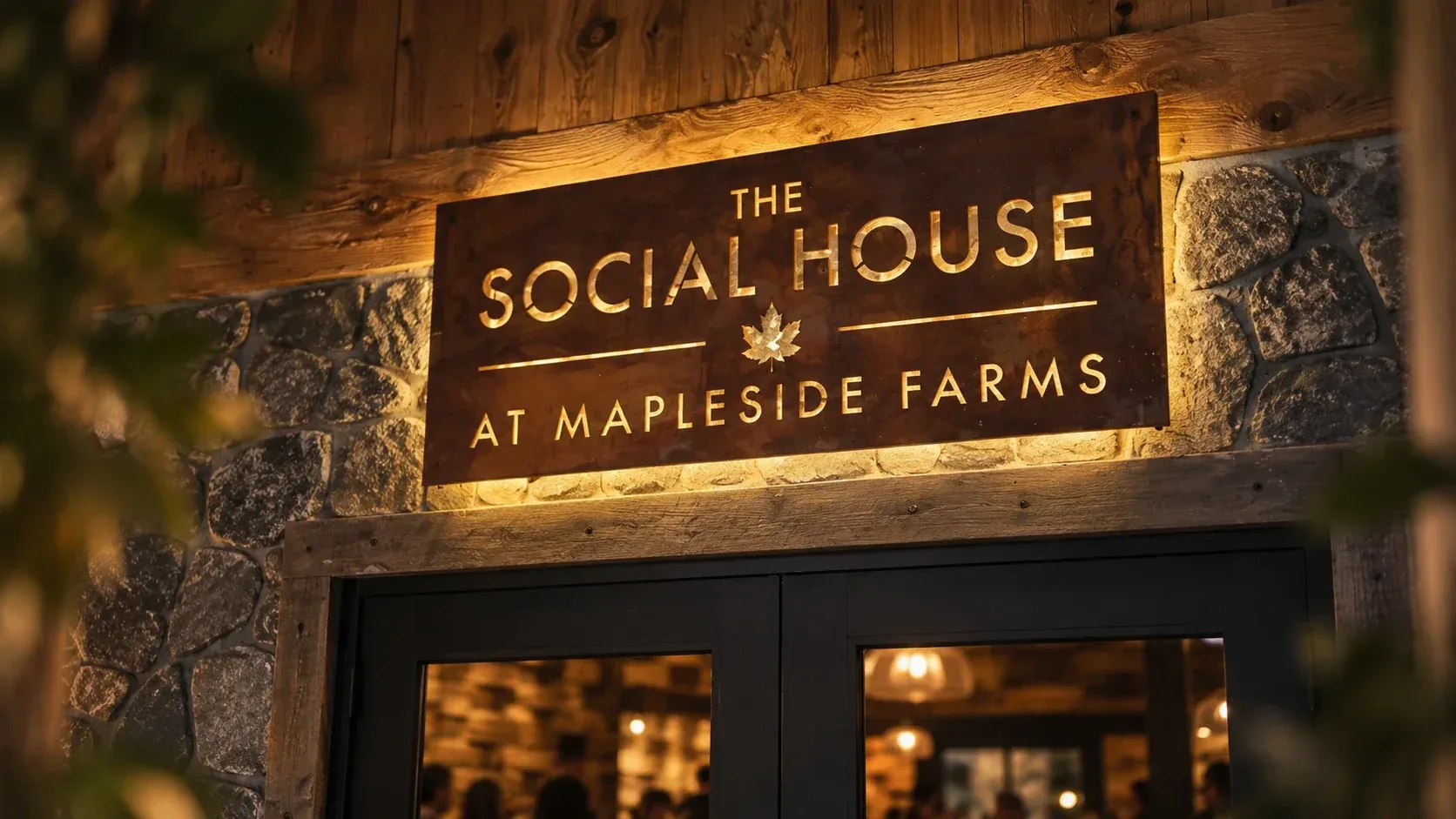
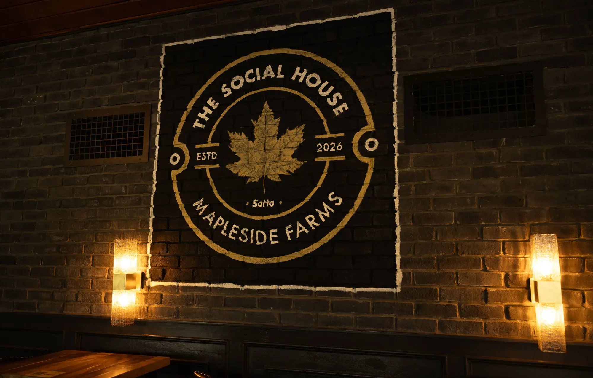
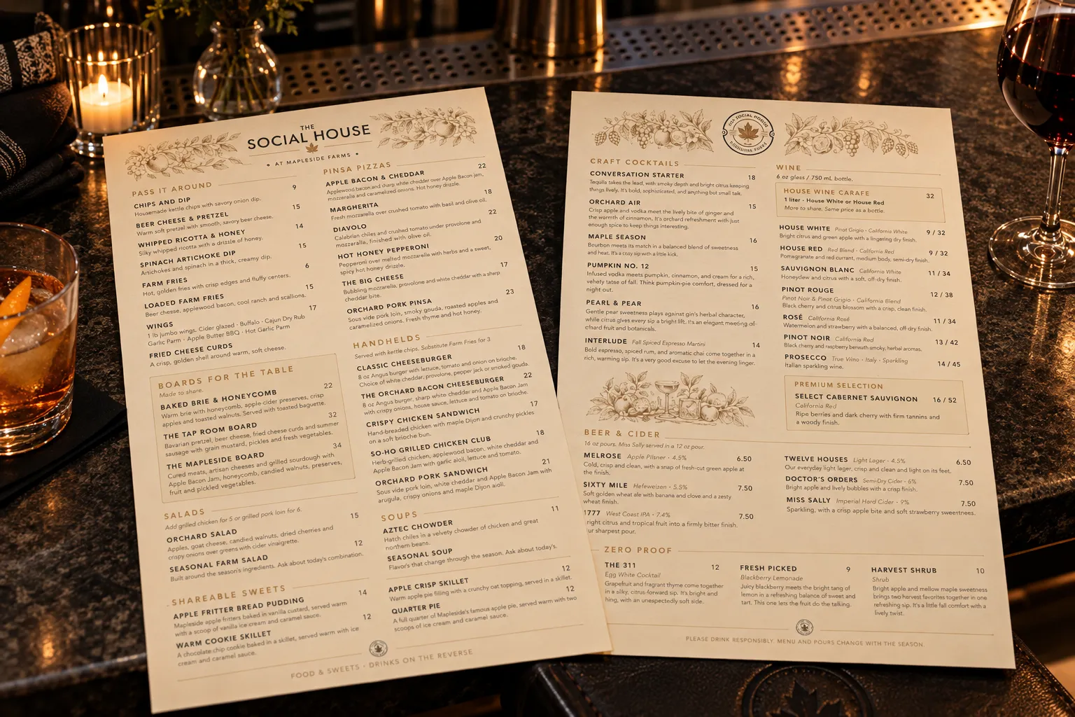
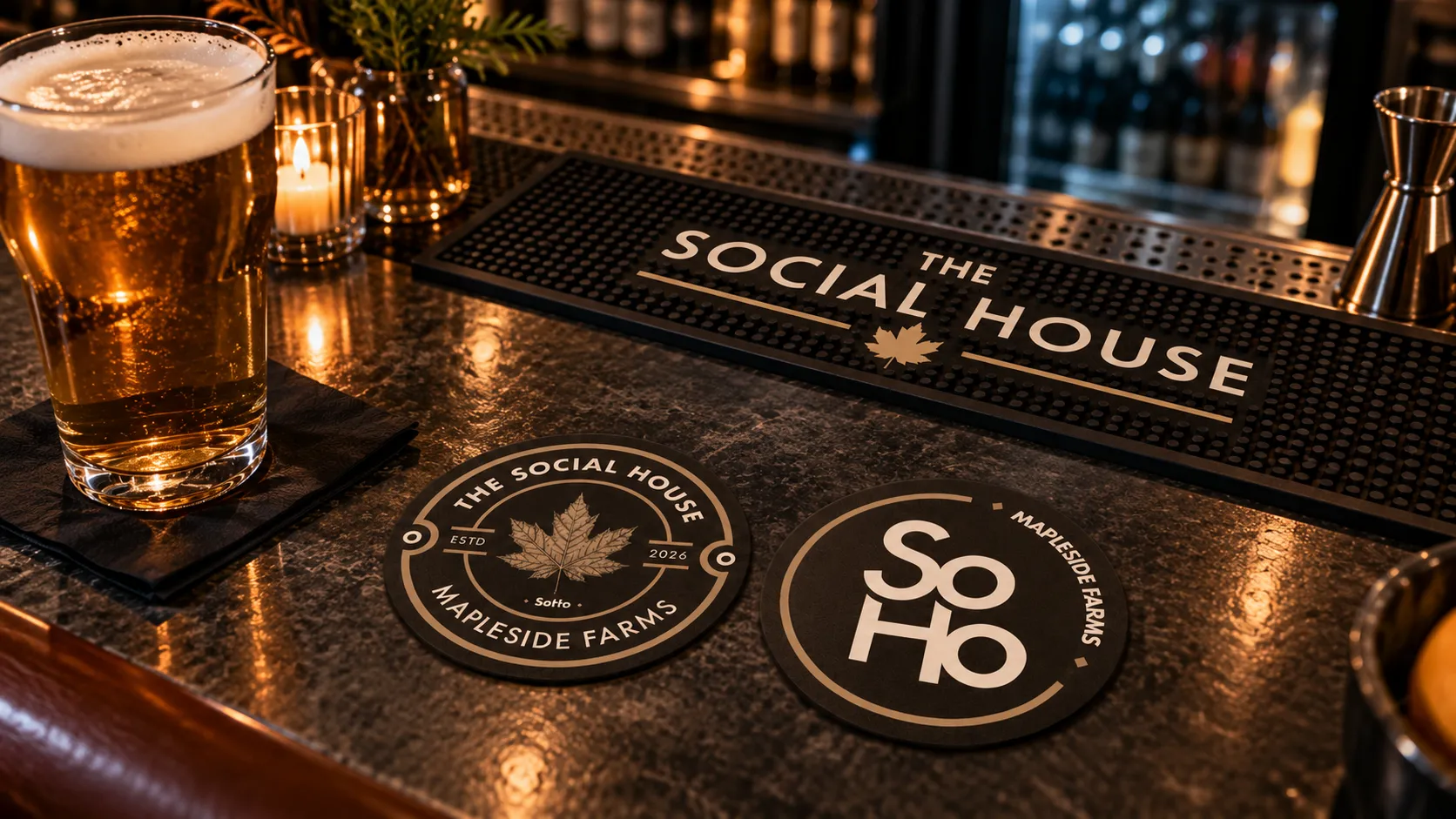
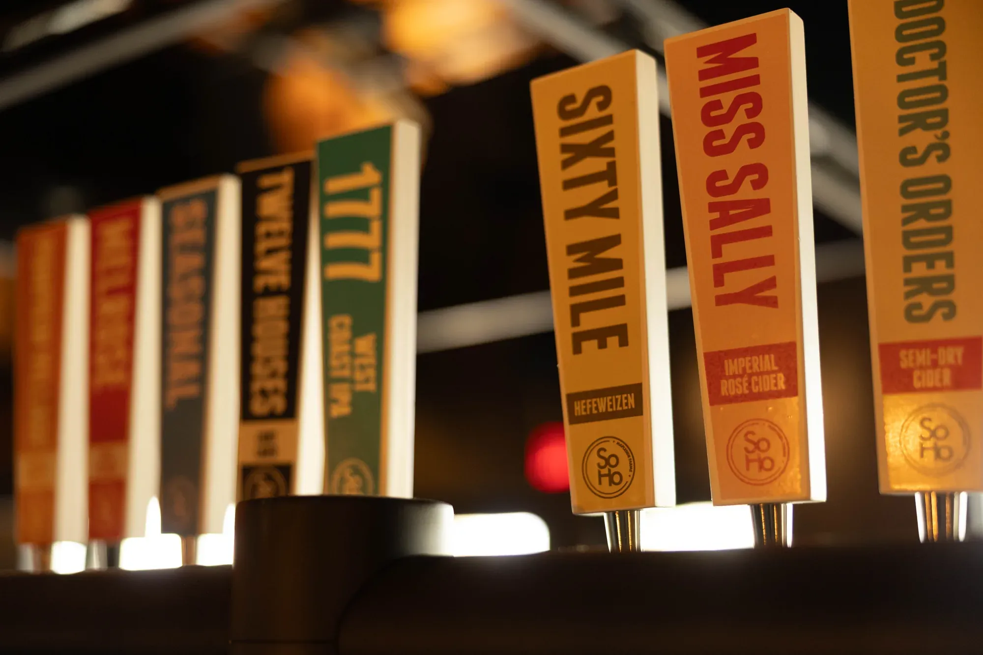
Mapleside's brand was already in place when I started; the Social House is the identity I built around the farm's own maple leaf. It is the farm's restaurant, winery and brewery under one roof, so it needed to read like a room you sit down in rather than another attraction you queue for. Three marks cover it. The full wordmark takes the front of house. The badge, with the engraved maple leaf and the 2026 date, goes on anything stamped, etched or poured. And SoHo — Social House, short — is the one that has to survive being embroidered on a chest pocket or pressed into a coaster, so it is drawn to hold at a fraction of the size of the other two.

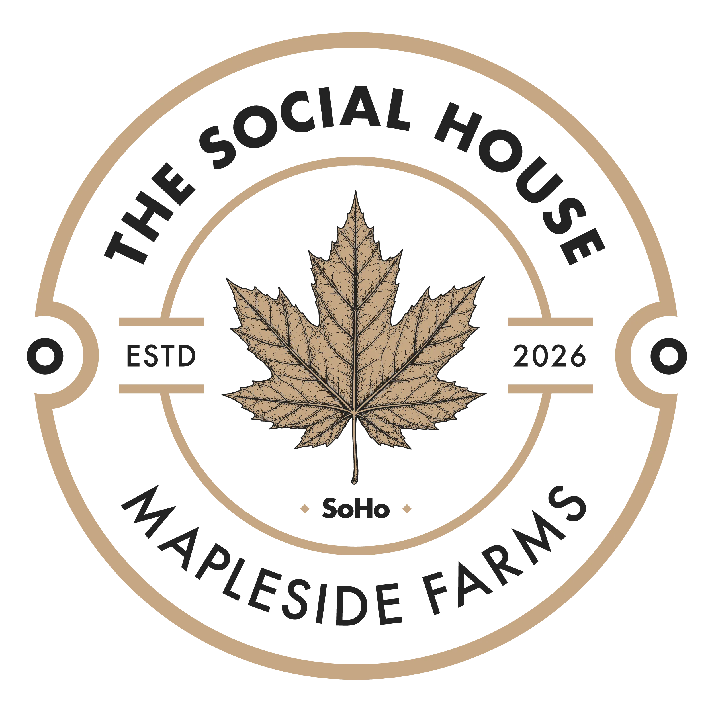
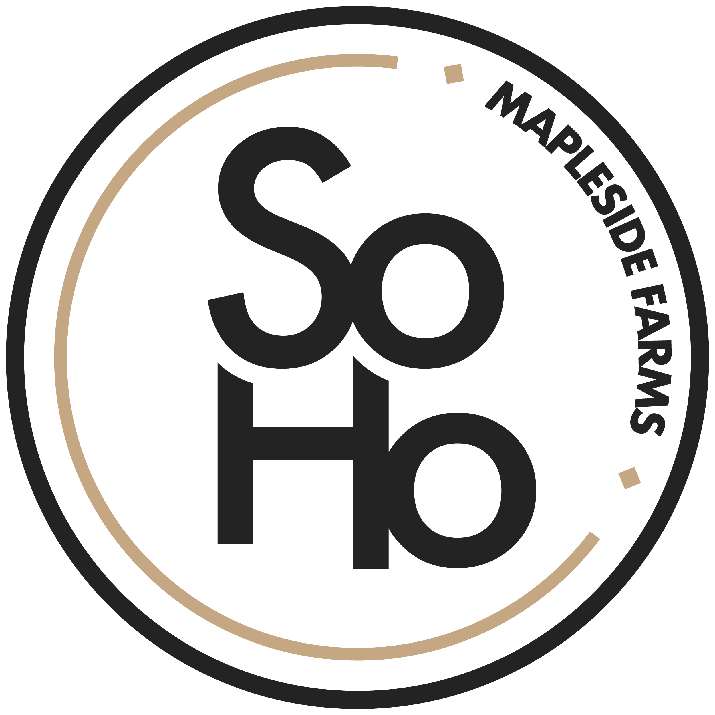
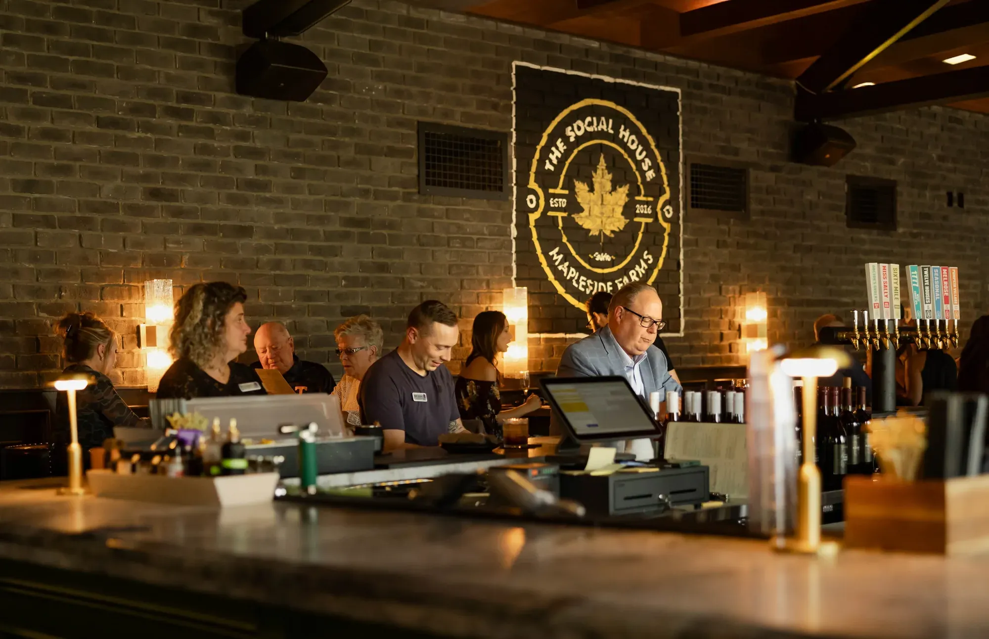
The wordmark goes up first, cut from rusted steel and backlit over the door; inside, the badge is painted across the brick behind the bar. The menu uses all three at once — wordmark on the food side, badge on the drinks, botanicals through both — and the badge and SoHo take the small jobs: coasters, tap handles, and the runner beneath them.
03 Wine
Eight labels that have to share a shelf.
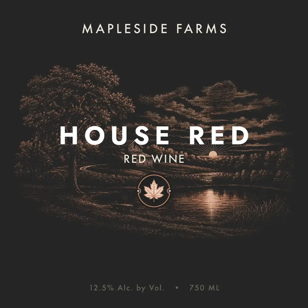
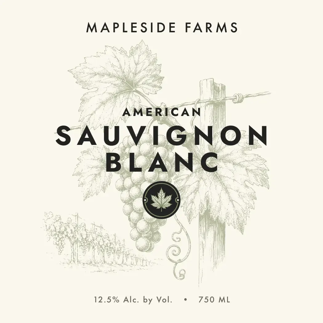
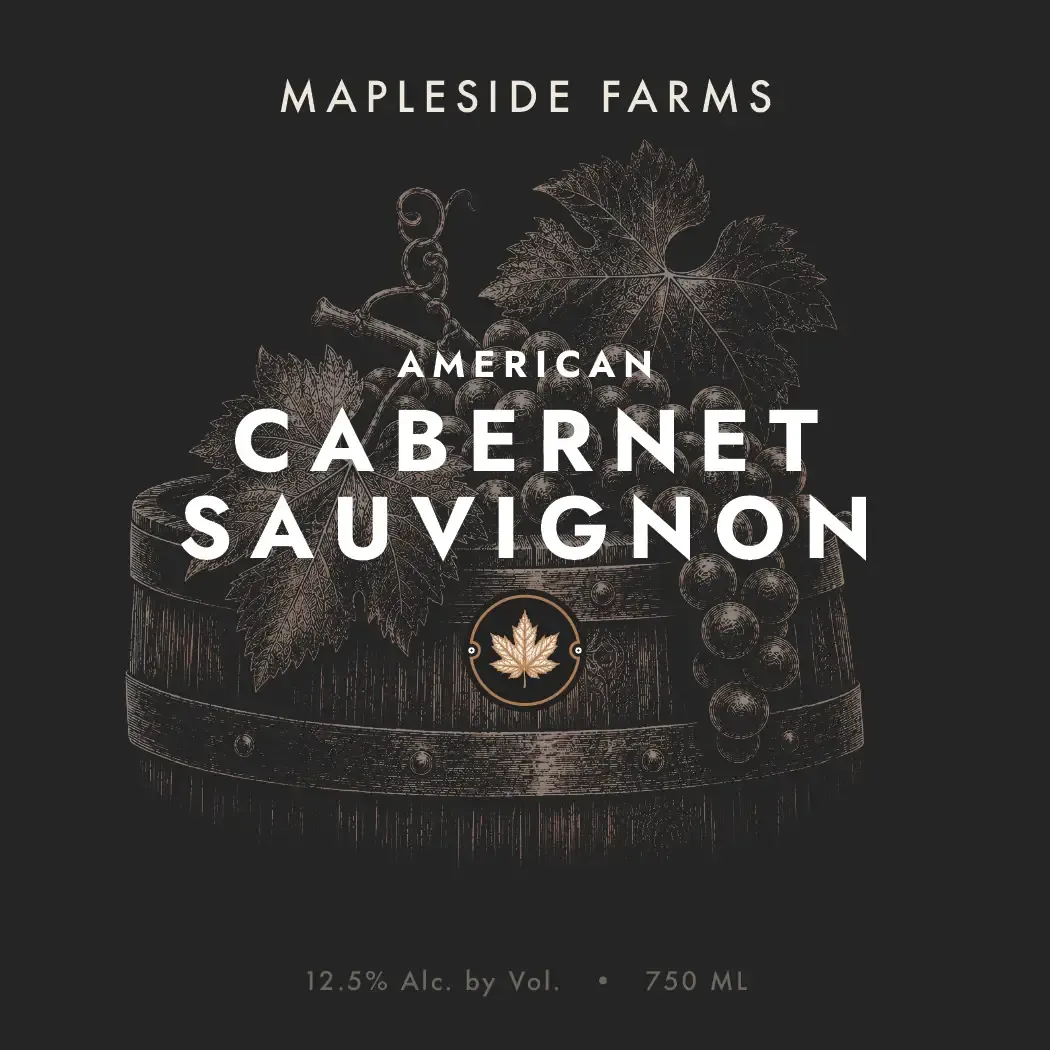
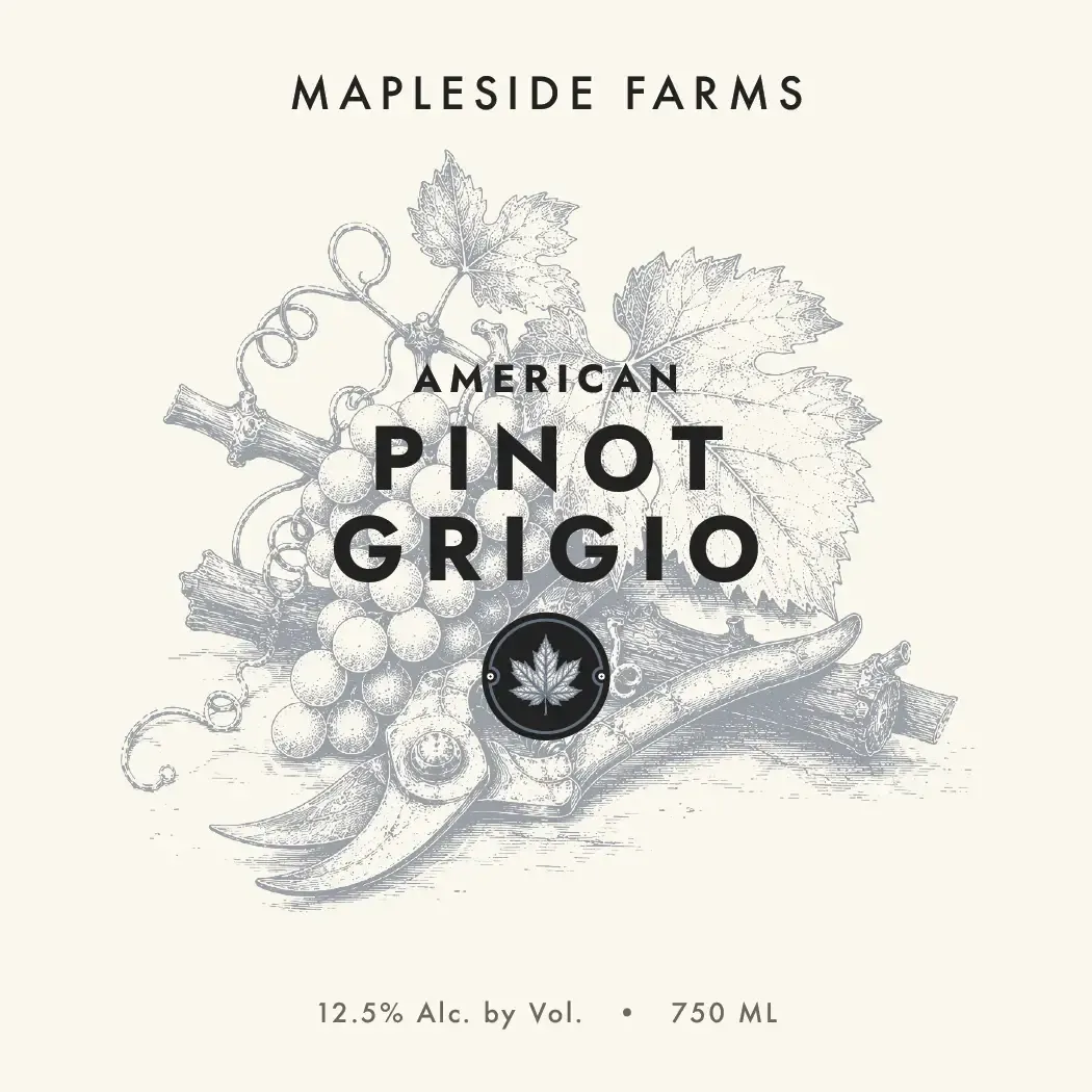
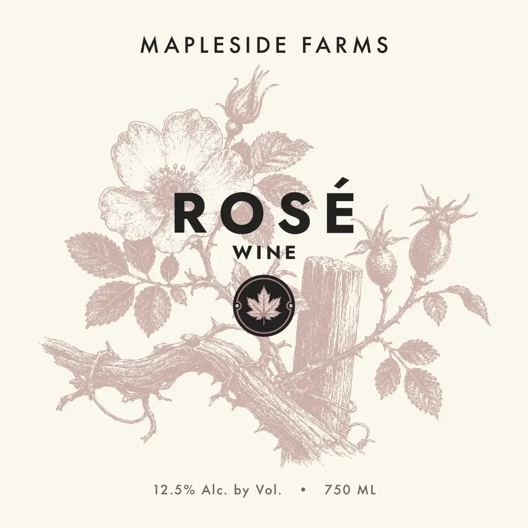
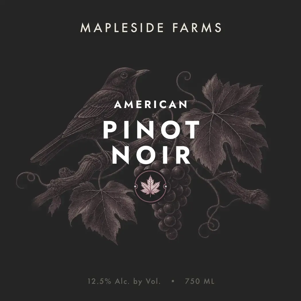
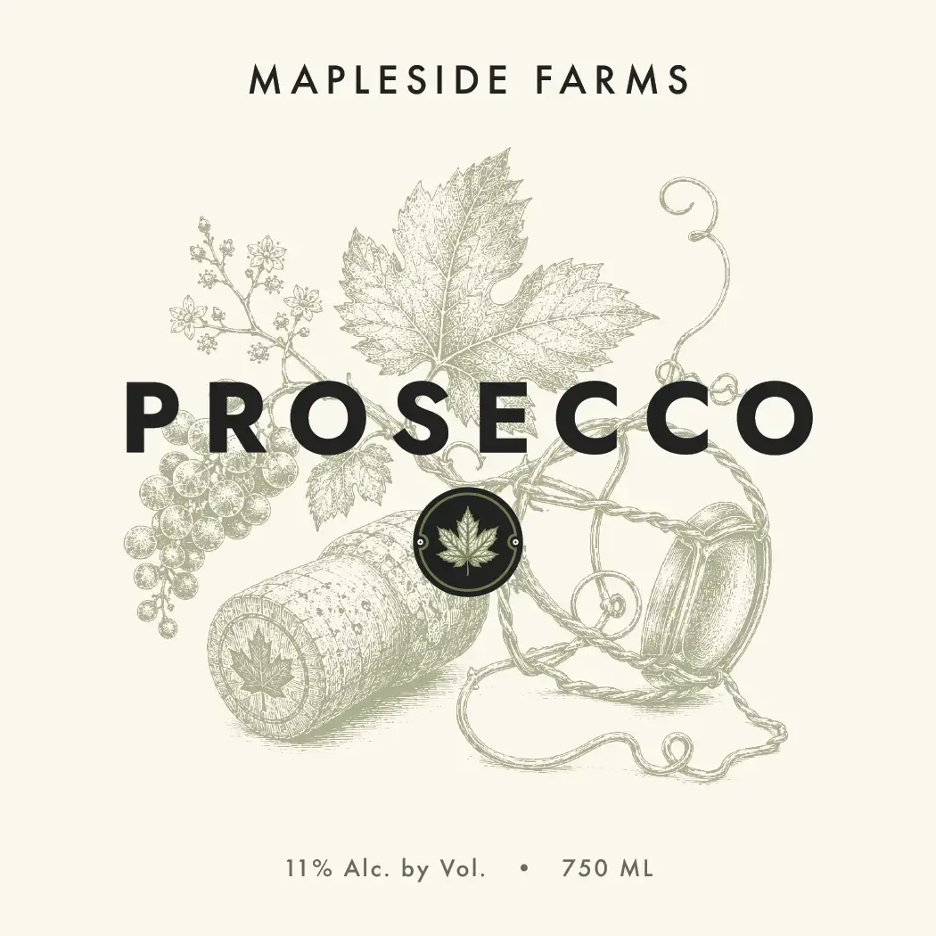
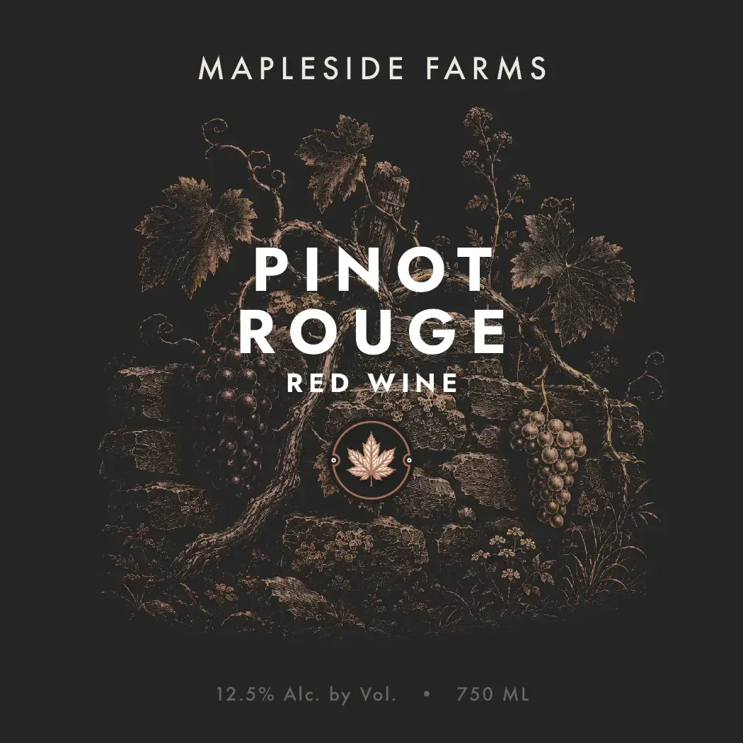
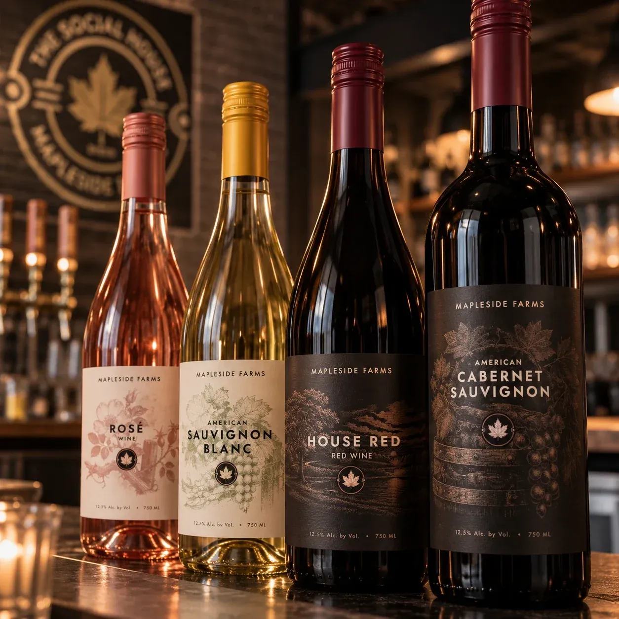
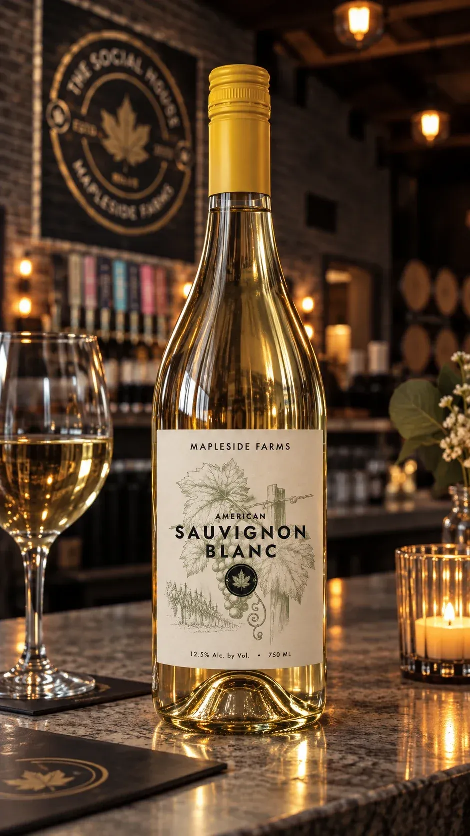
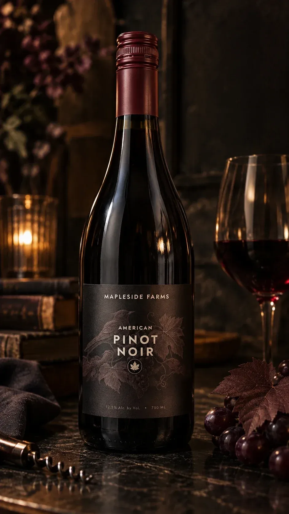
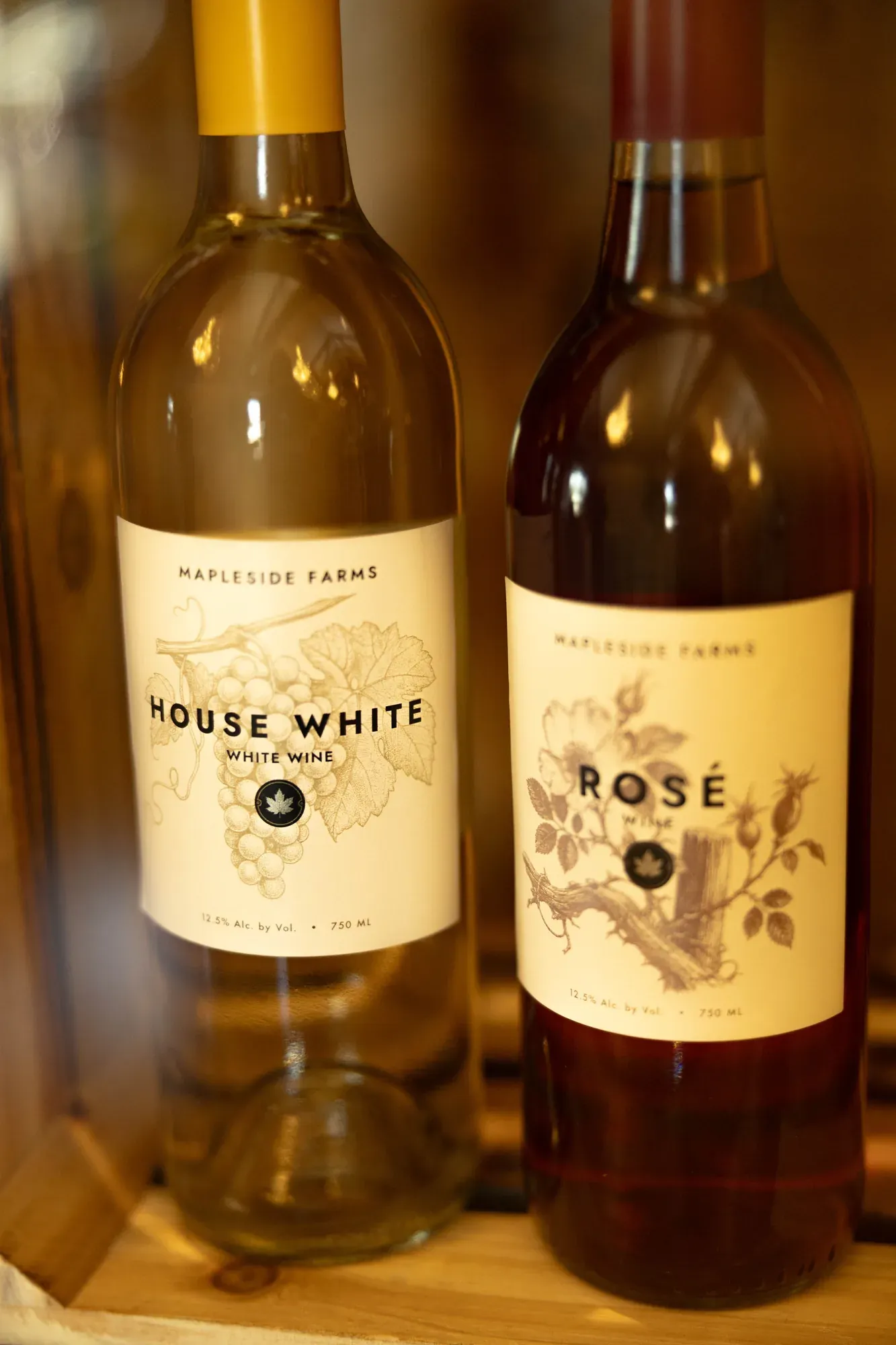
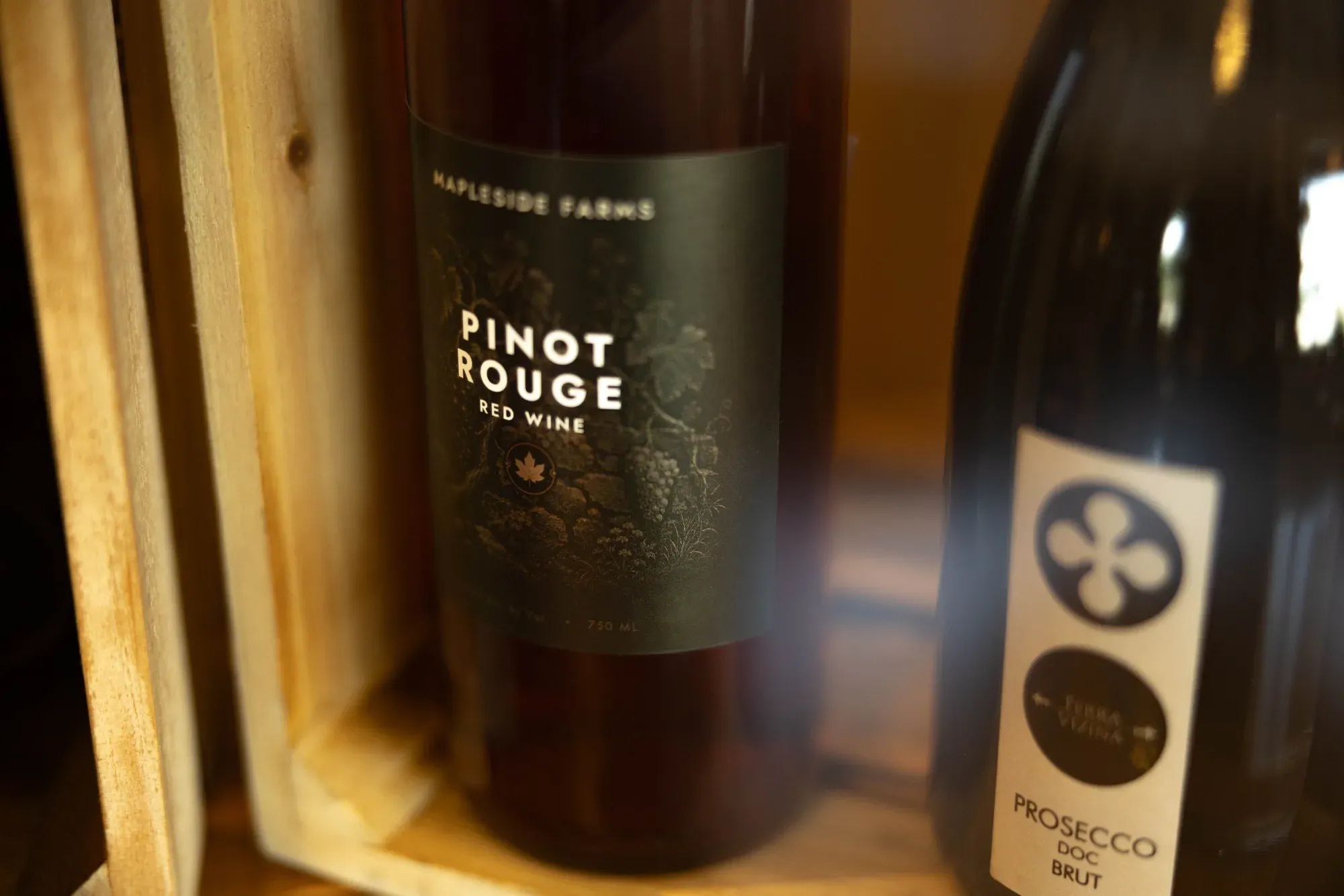
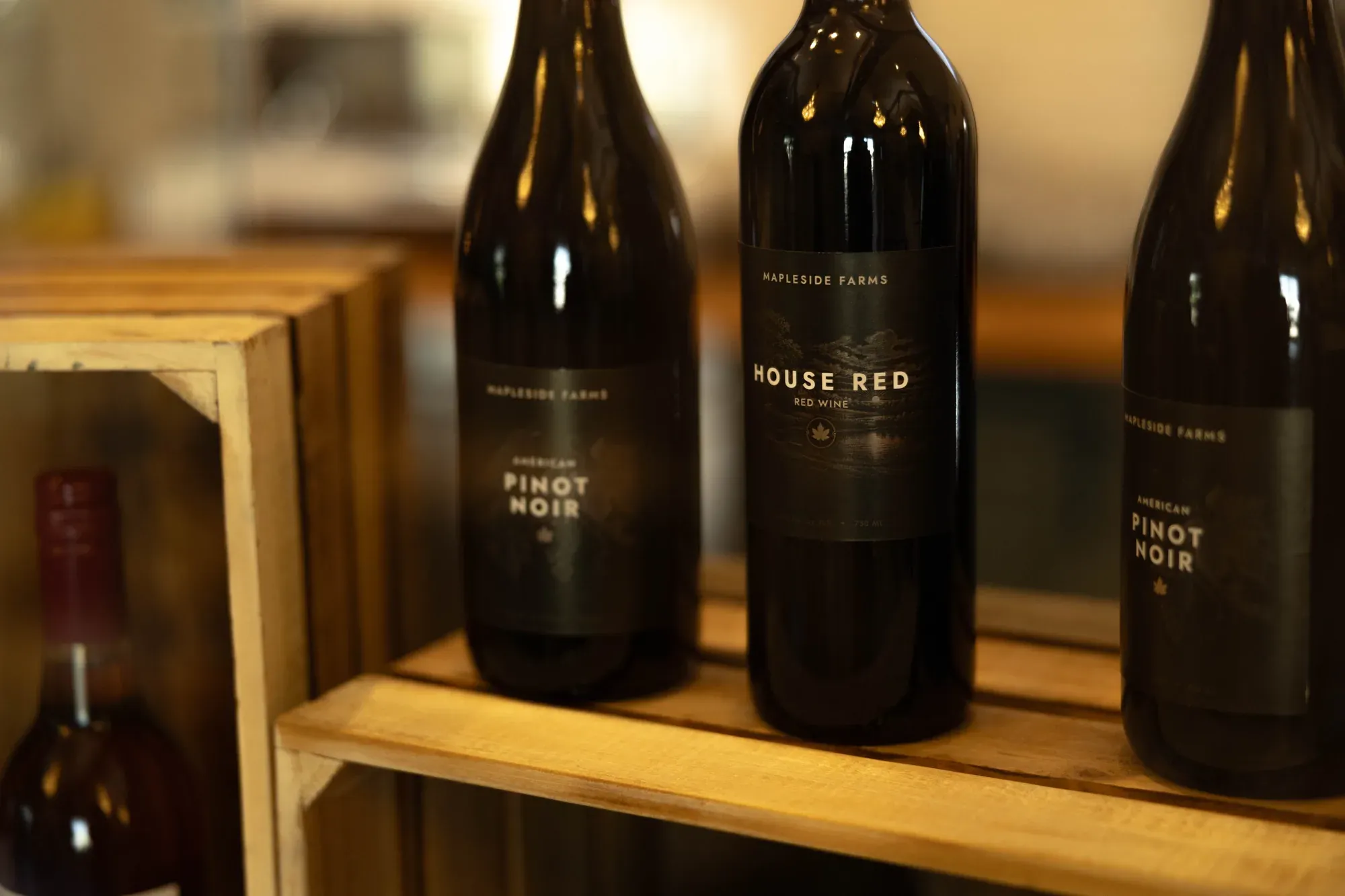
The Social House pours the farm's own label, which meant the bottles had to carry Mapleside's name and still sit inside the Social House identity I had just built. Each label is one engraved illustration taken from what is actually in the glass: the orchard pond at dusk for the House Red, a cellar barrel for the Cabernet, a songbird in the vines for the Pinot Noir, a wild rose for the Rosé, a cork and a curl of vine for the Prosecco. Reds sit on near-black, whites on cream, and the maple-leaf seal lands in the same spot on all eight — so however they get arranged behind the bar, they read as one family from across the room.
Like the look of this? Let's make yours.
More work · 03 of 12

Northgrain
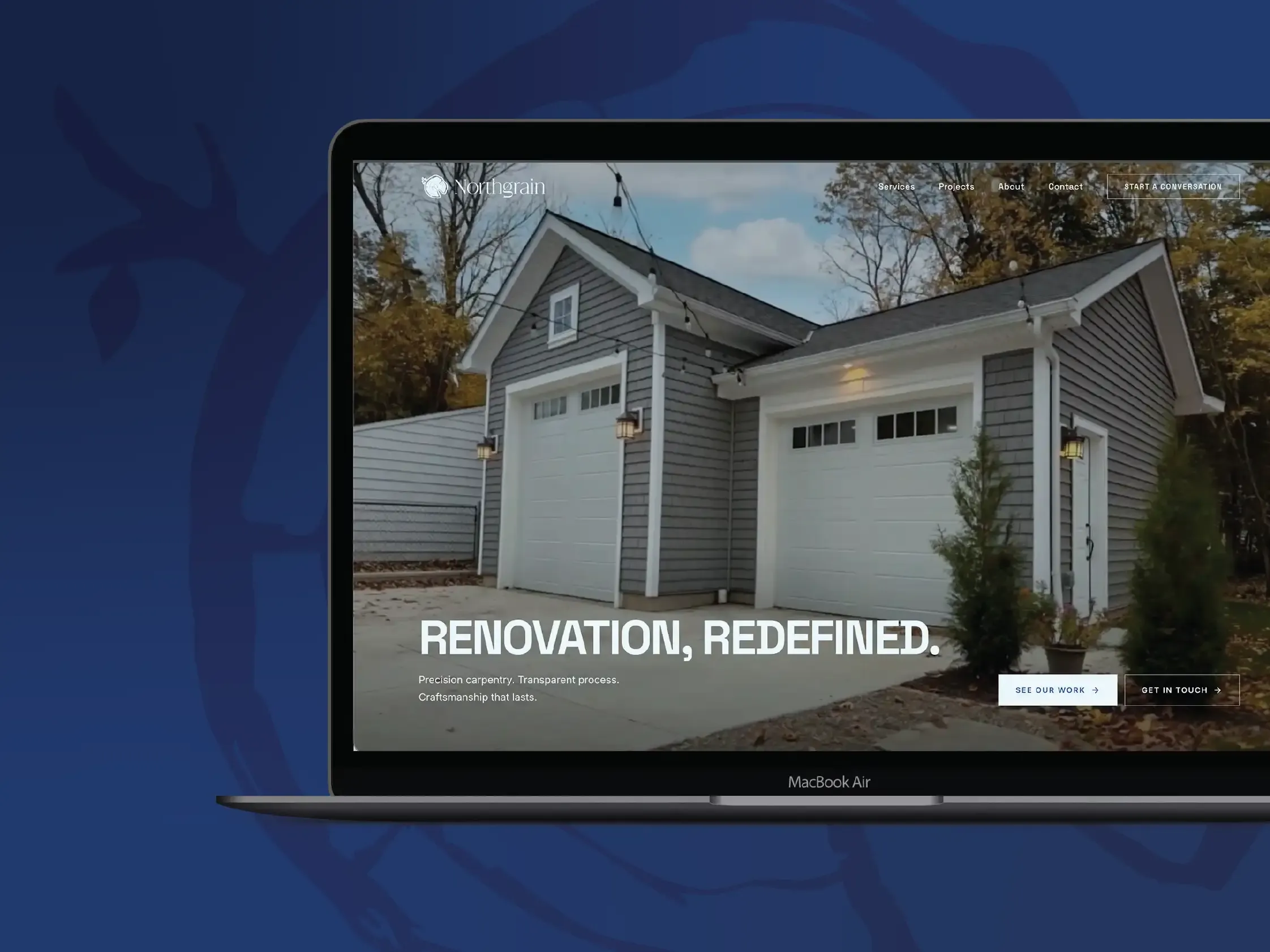
Renovation, redefined. A carpentry brand and site built to win bigger jobs.
- Branding
- Web Design