
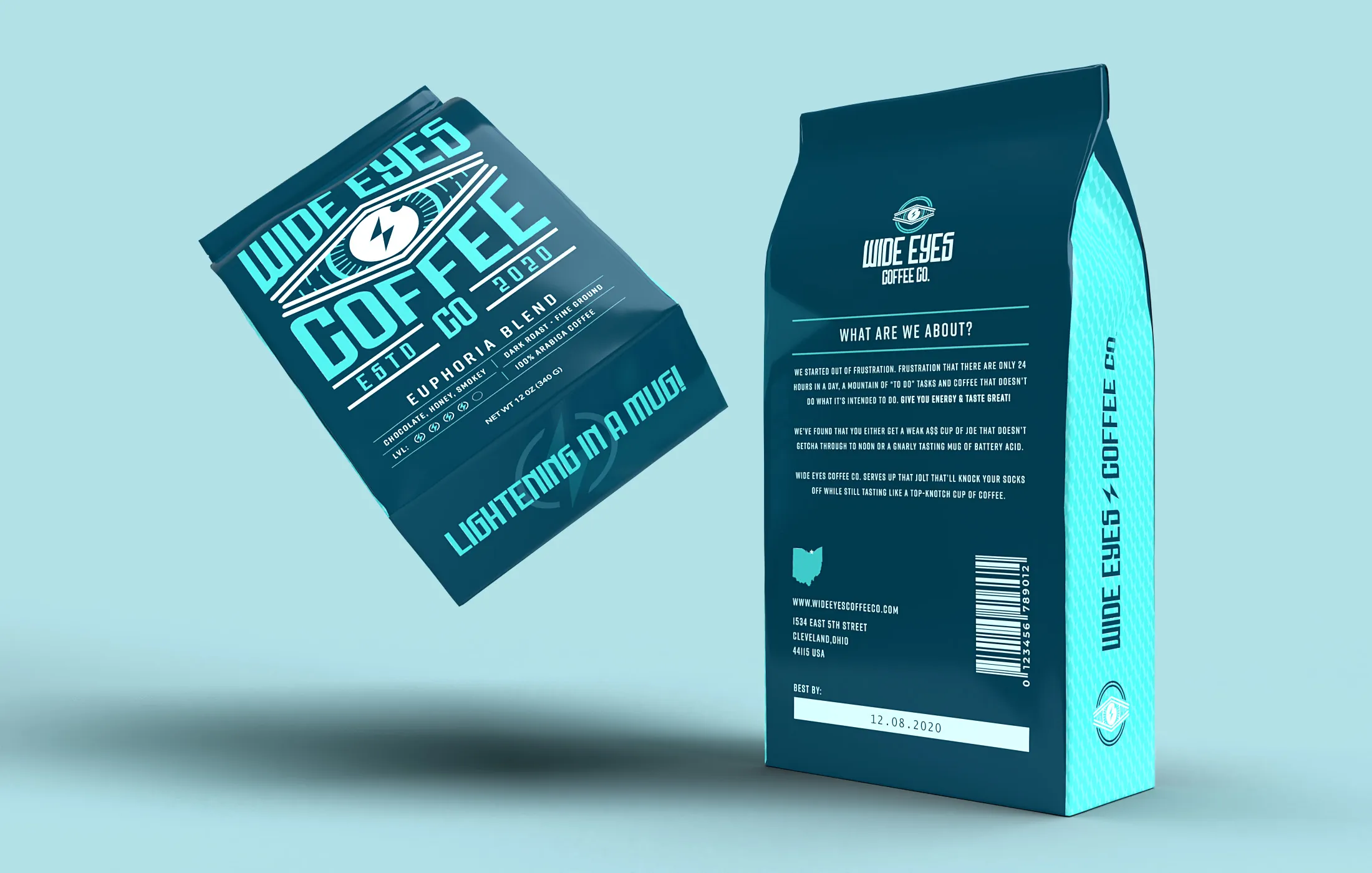
Wide Eyes is a self-initiated coffee brand built on one complaint: most coffee is either too weak to get you to lunch or too harsh to enjoy.
The identity answers with an eye pulled wide open and a lightning bolt where the pupil should be, two colours that behave like a warning label, and a bag that actually explains itself. The project covered naming, the mark and its animation, packaging front to back, and the cups, coasters and signage around it.
01 Identity
An eye, wide open, with a bolt through it.
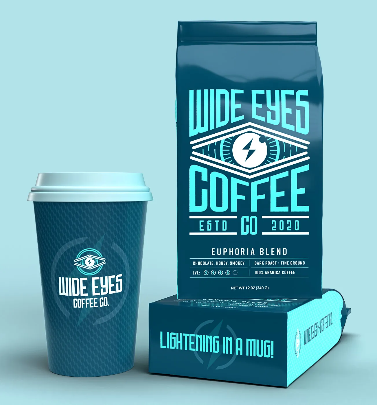
The whole brand is one moment: when the caffeine lands. The mark draws that literally — an eye stretched open with a bolt for a pupil, set in a lens of straight lines so it stays legible at coaster size and on a sign across the street. Condensed display type underneath pushes it closer to an energy brand than a café, which is the point.
02 Packaging
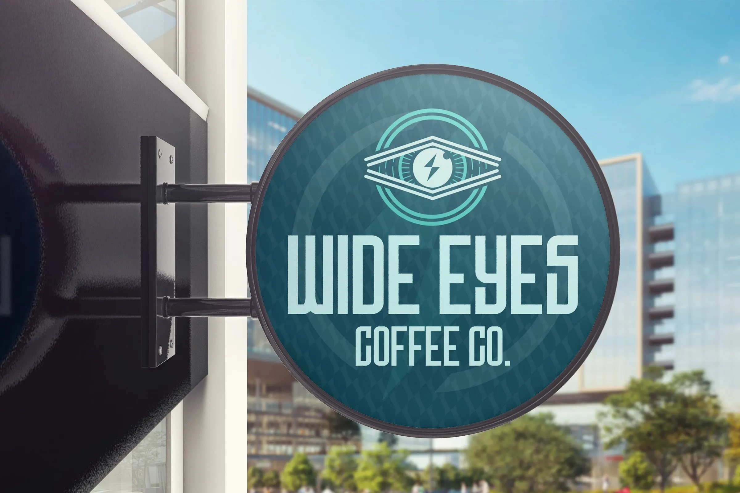
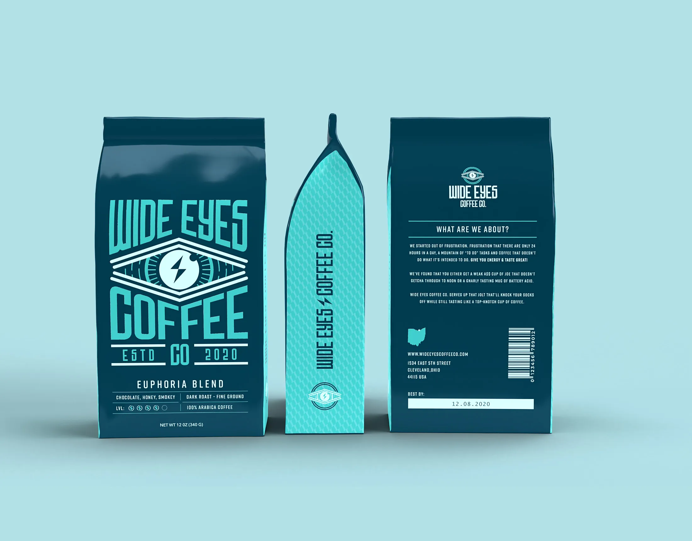
A bag that argues its case.
There are only so many ways to print the word strong, so the back of the bag makes the argument instead: why the company exists, what a jolt without the bitterness is supposed to taste like, and what is actually in the Euphoria Blend. Front and back run the same electric aqua on deep teal, so a shelf of them reads as one block of colour rather than six competing labels.
03 In hand
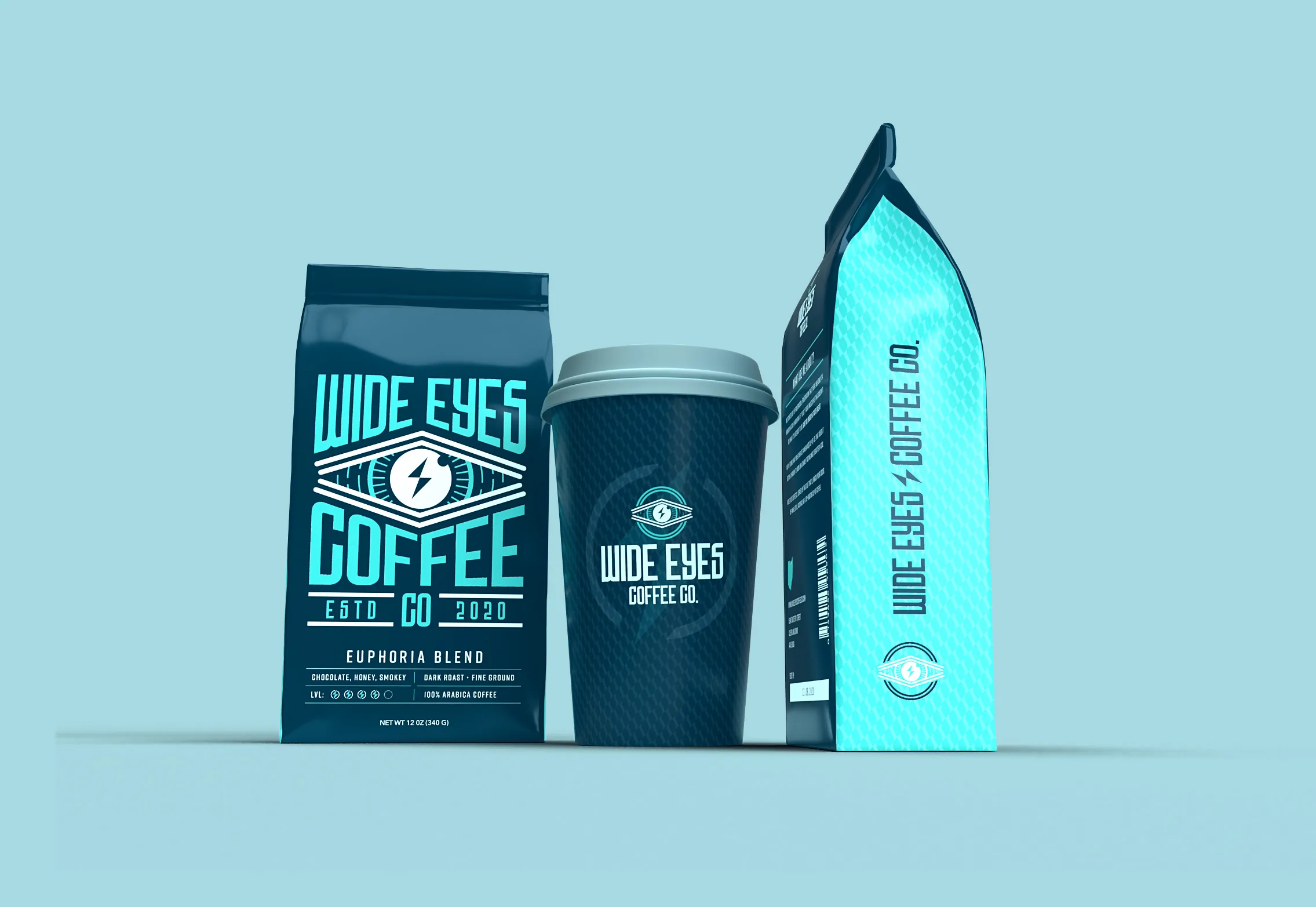
It has to work small and dark.
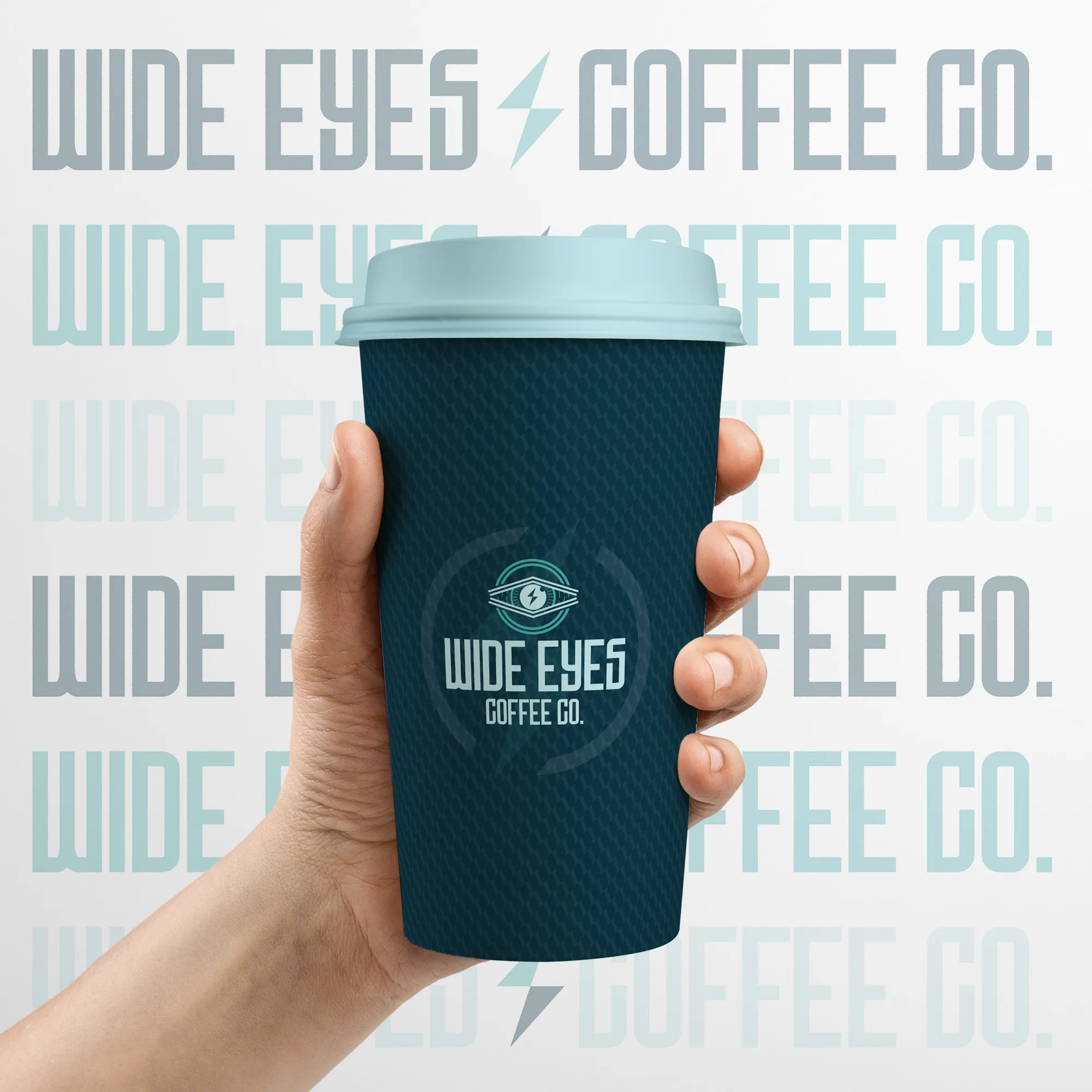
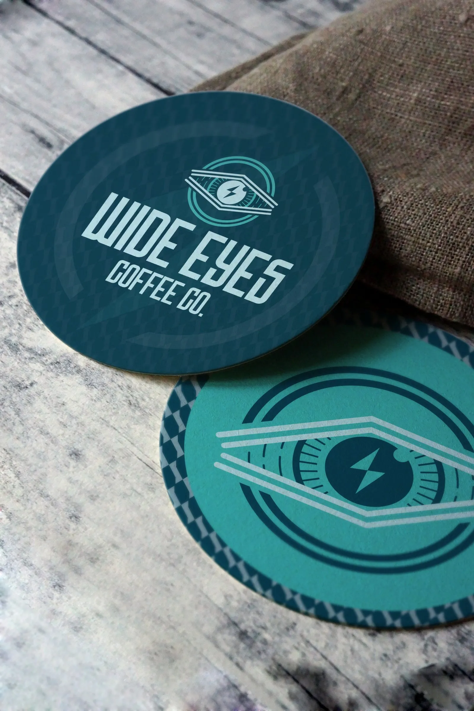
A mark this detailed usually falls apart once it is printed on a sleeve or a beer mat. This one holds because the drawing never changes weight and the palette never leaves two colours: everything is the deep teal or the aqua, and nothing in between.
Like the look of this? Let's make yours.
More work · 01 of 12
Freedomology
A brand for health, wealth and relationships, built from zero to 7,000 members in 90 days.
- Branding
- Web Design
- UI/UX
- Motion Graphics