
Arc2FE welds and fabricates steel. The name is the job, an arc applied to Fe, so the mark builds an A out of the arc itself.
The system around it is documented tightly enough that a foreman ordering vests and an accountant building a letterhead land in the same place: three lockups with minimum sizes, three colours with print and screen values, two typefaces, and a fourteen-page guide that answers the questions before they get asked.
01 Logo
Three that said contractor. One that said fabricator.
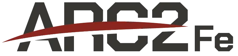
The first round leaned on the letters: a swoosh under the name, a monogram in a roundel, a stacked block. All of them could have belonged to any trade on the site. The one that won builds the A out of the arc itself, with the counter cut as a clean diagonal so it holds as a shape long before anyone reads the word.

02 The system
Three lockups, one shape.
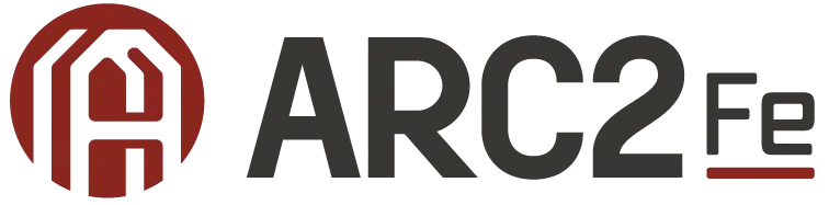
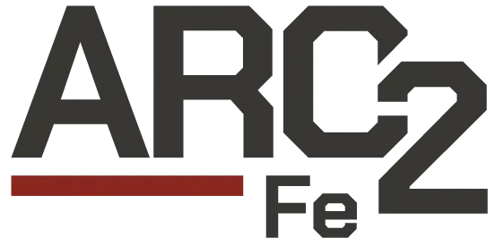
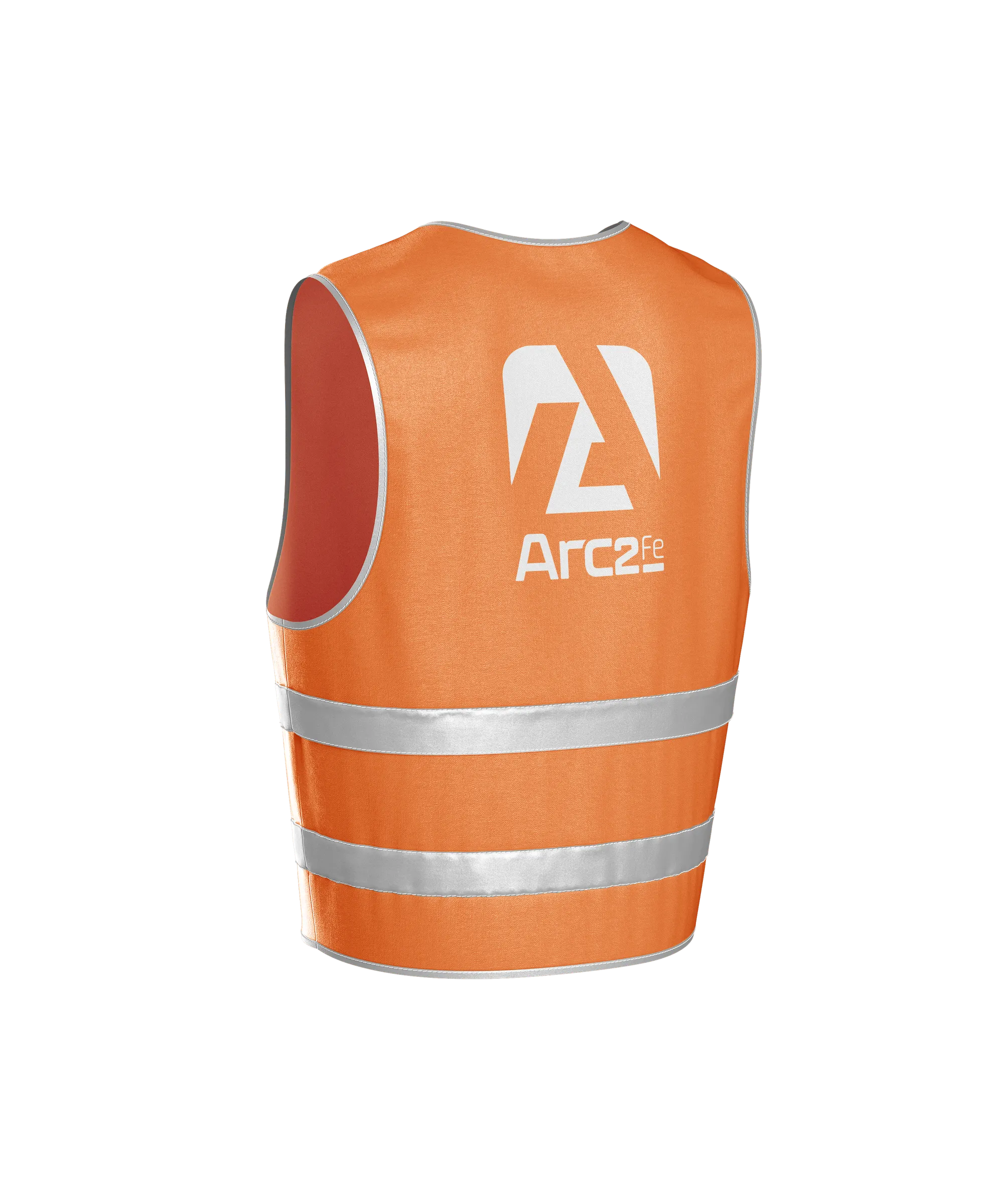
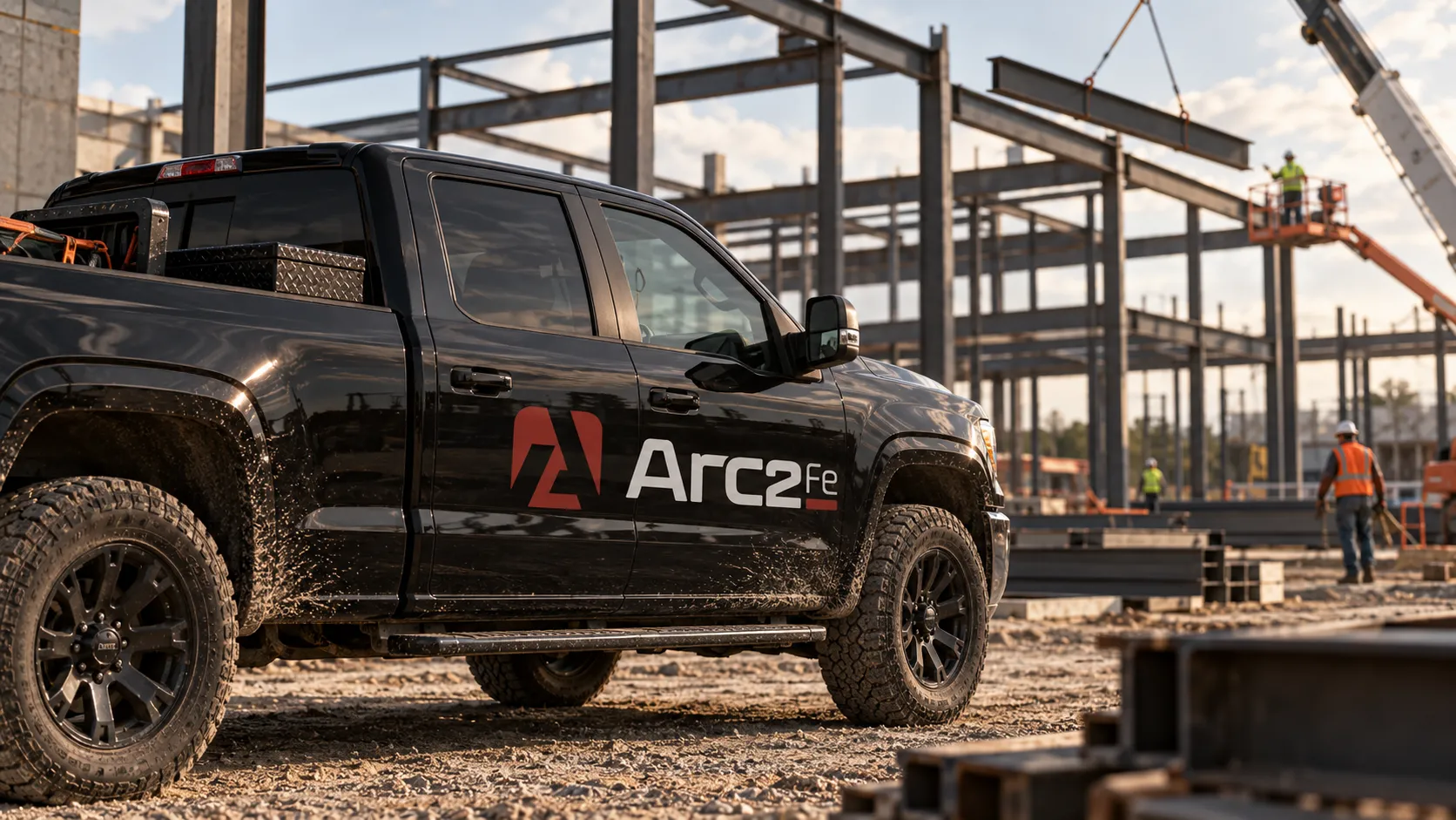
The primary runs horizontal. The vertical takes over wherever width runs out, which on this job is most places: a hat, a chest pocket, a truck door. The symbol alone carries the rest, down to half an inch, because on a site everything eventually gets printed small.



03 Color & type
Charcoal, burgundy, steel.
Charcoal carries most of the weight, burgundy does the pointing, and a steel grey sits between them for everything that is neither. Three colours is deliberate — a shop orders in small runs, and a palette you can hold in your head is one that survives the third vendor.
A squared, semi-expanded face for headlines, because it reads like something machined. Montserrat underneath it, because a spec sheet has to be readable at eight point on a photocopy.
- Arc2Fe
- Fabrication
- Cut, welded, delivered
04 Applications
It ends up on a hat.
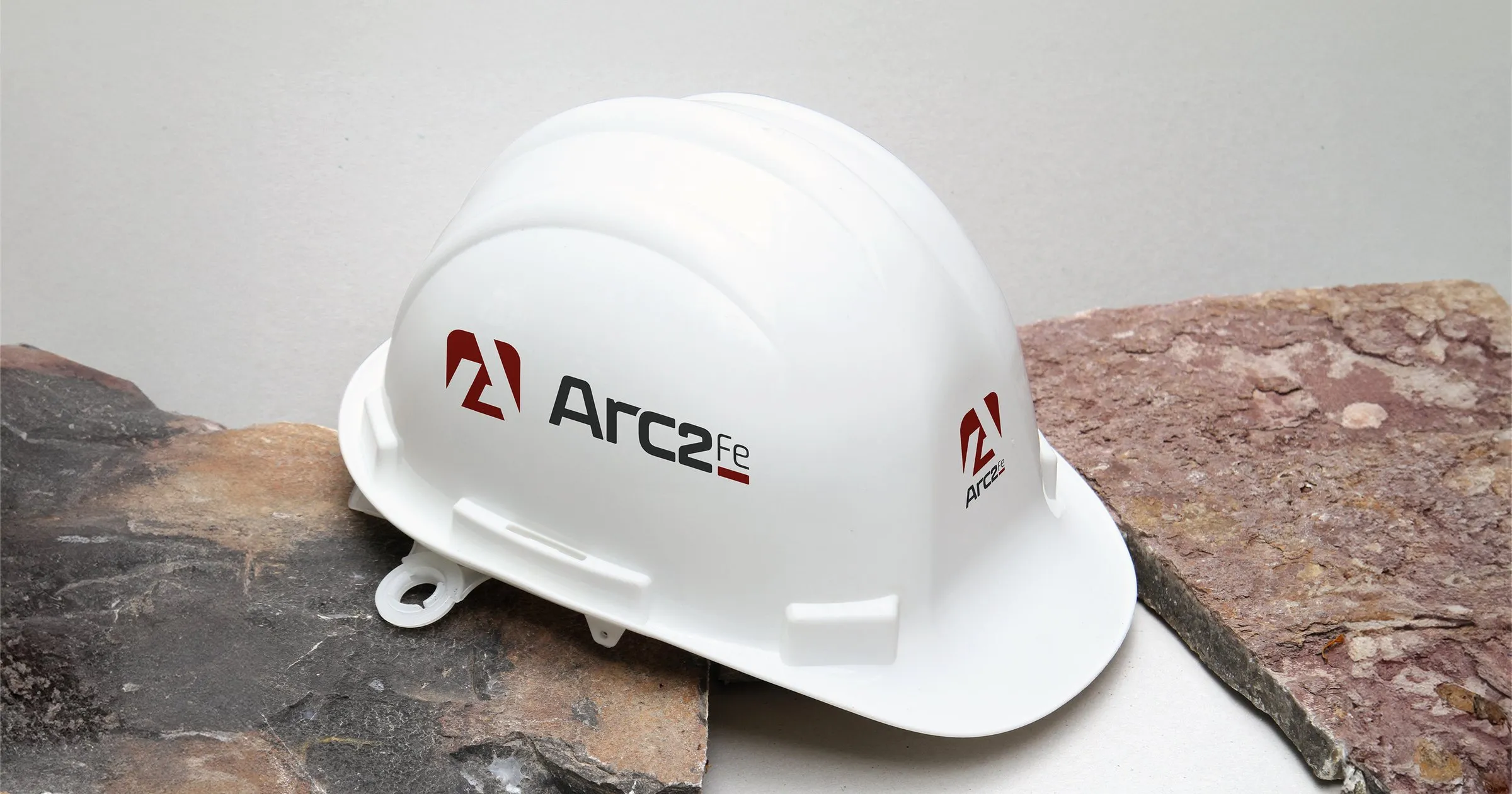
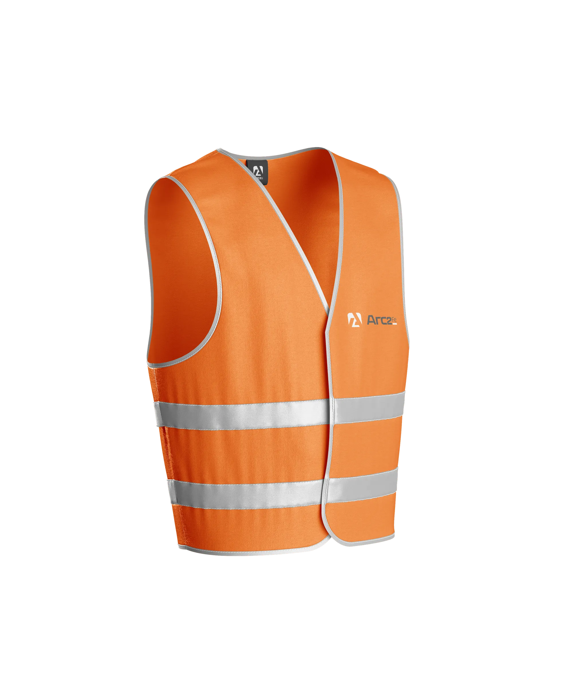
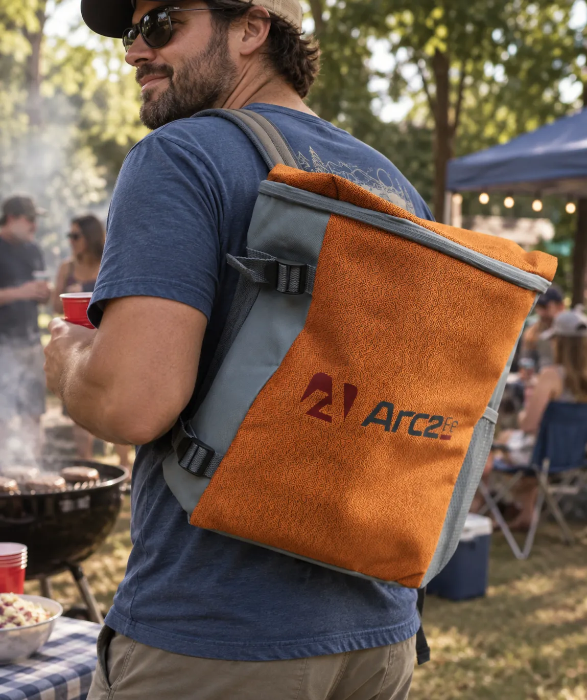
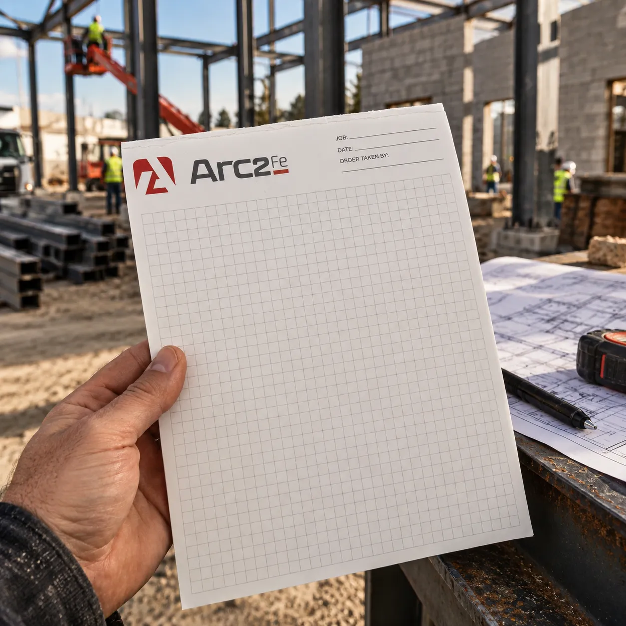
Every decision above gets tested the same way: print it small, print it on something orange, print it on something curved. The symbol goes on the side of the helmet, the vertical lockup goes on the back of the vest where a foreman can read it across a yard, and the horizontal sits anywhere there is room for it — a chest pocket, or the front of a bag that leaves the site and turns up at a cookout.
05 Style guide
Fourteen pages so nobody has to ask.
The whole thing is written down: which lockup goes where, the minimum size for each in inches, all typography and color codes, and how to combine the logo with imagery. A small shop doesn’t have a brand manager, so the document has to act as one.
Download the style guideDownload the style guide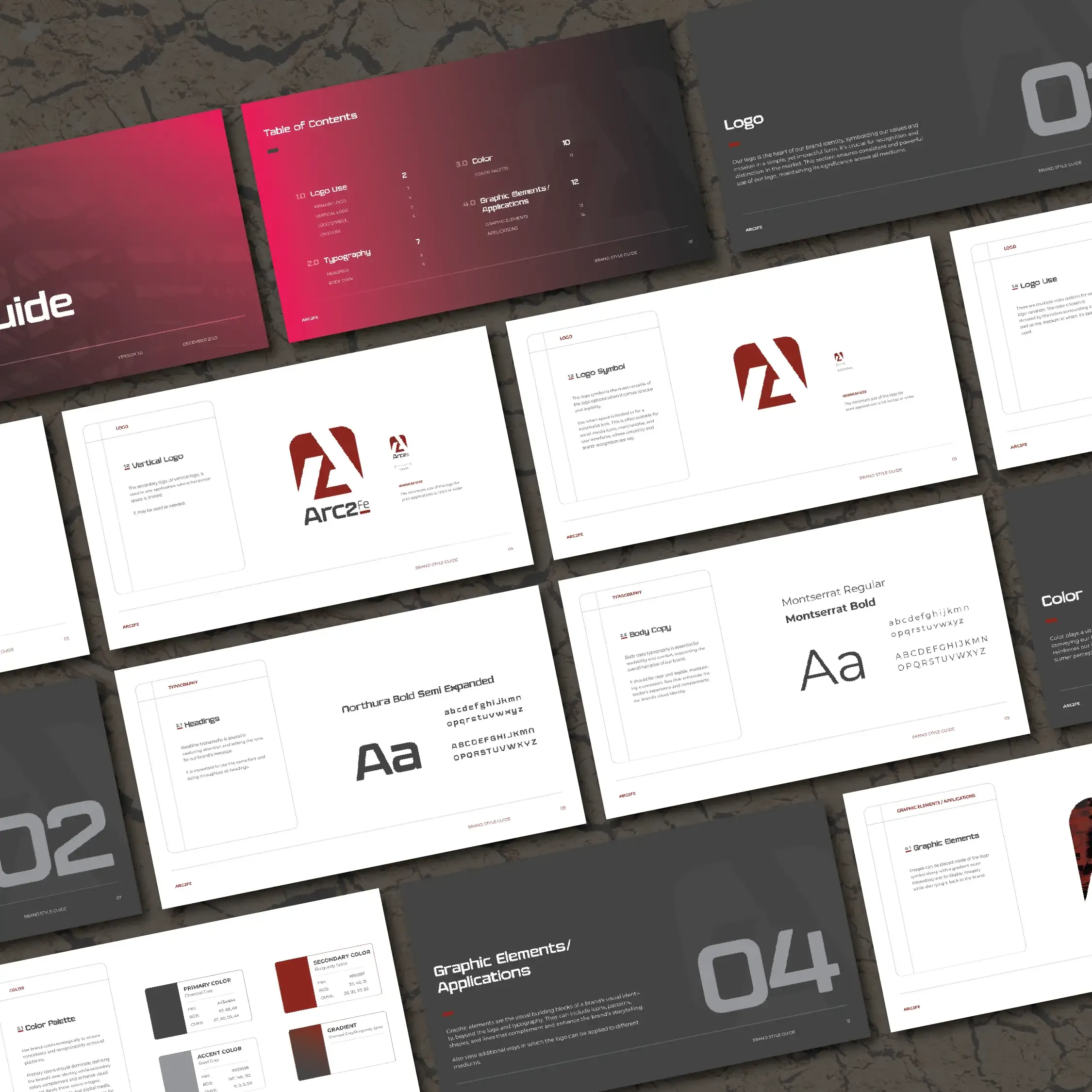
Like the look of this? Let's make yours.
More work · 06 of 12


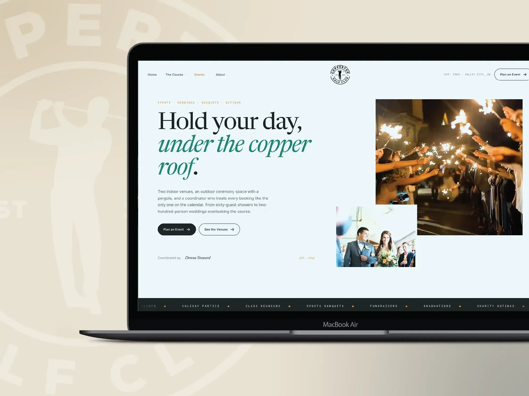
Coppertop Golf Club
A 1963 golf club, events venue and wedding house, given a modern voice.
- Web Design
- Digital Marketing
- Campaigns