
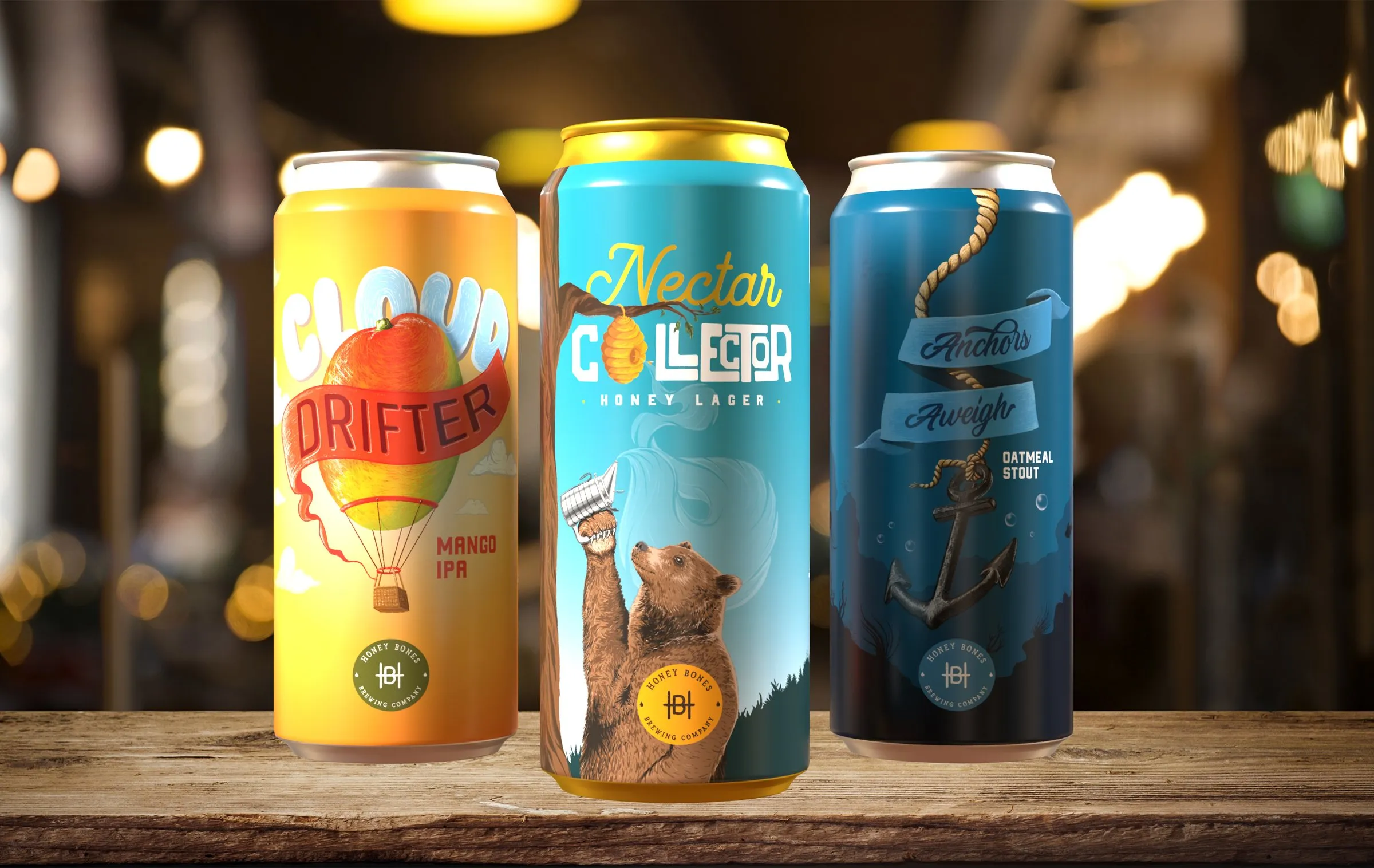
Honey Bones is a self-initiated brewery brand built to answer one question: how do you stand out on a shelf of a hundred cans? The answer was illustration you want to pick up.
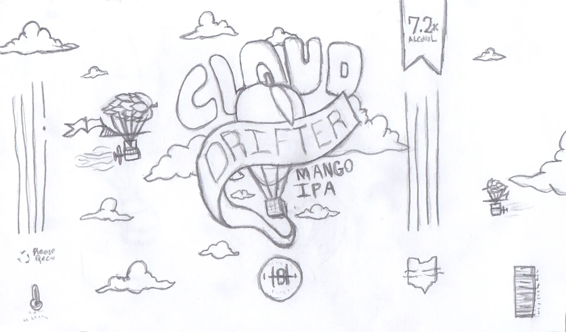
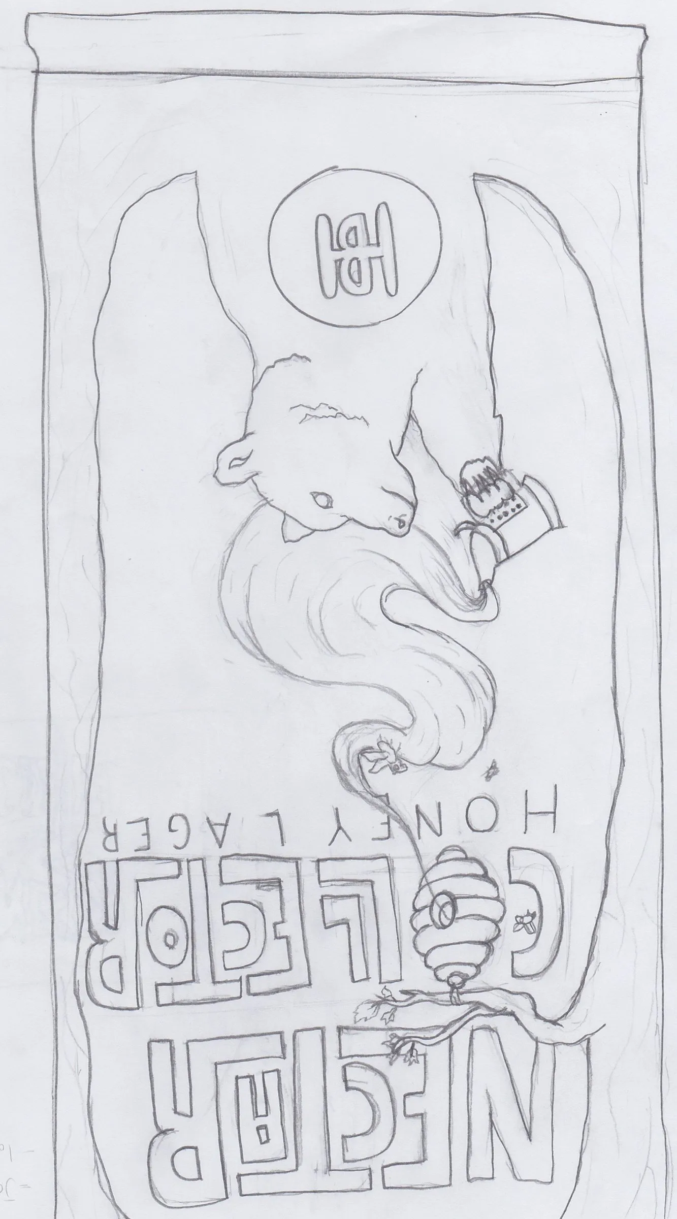
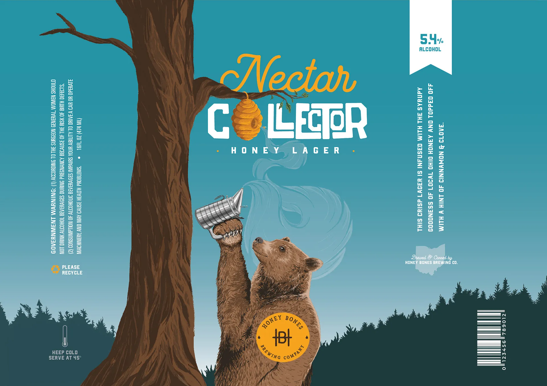
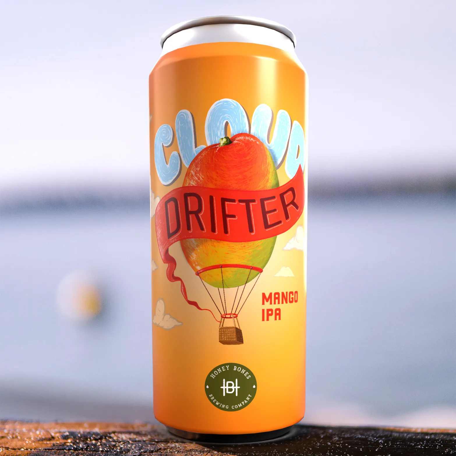
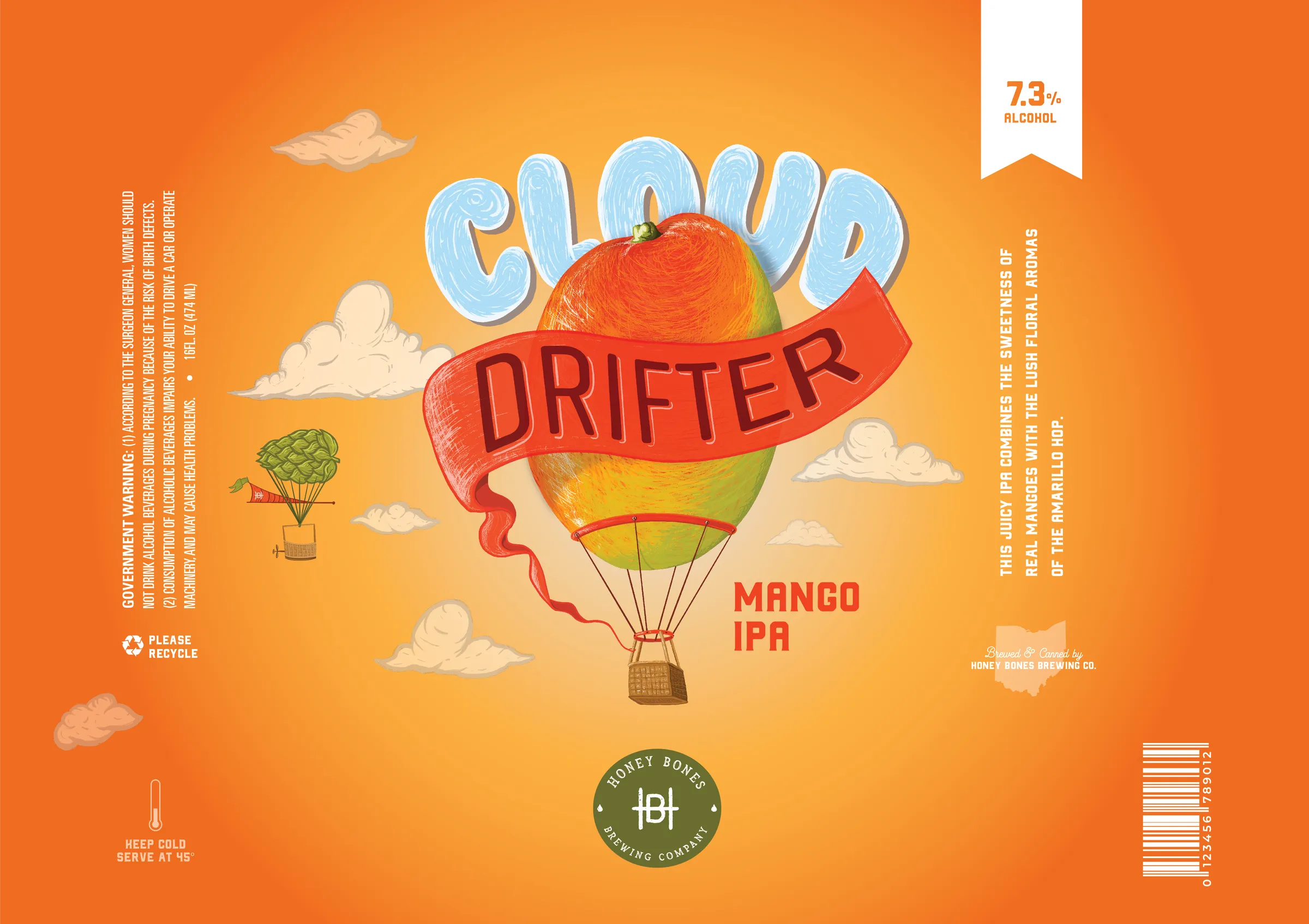
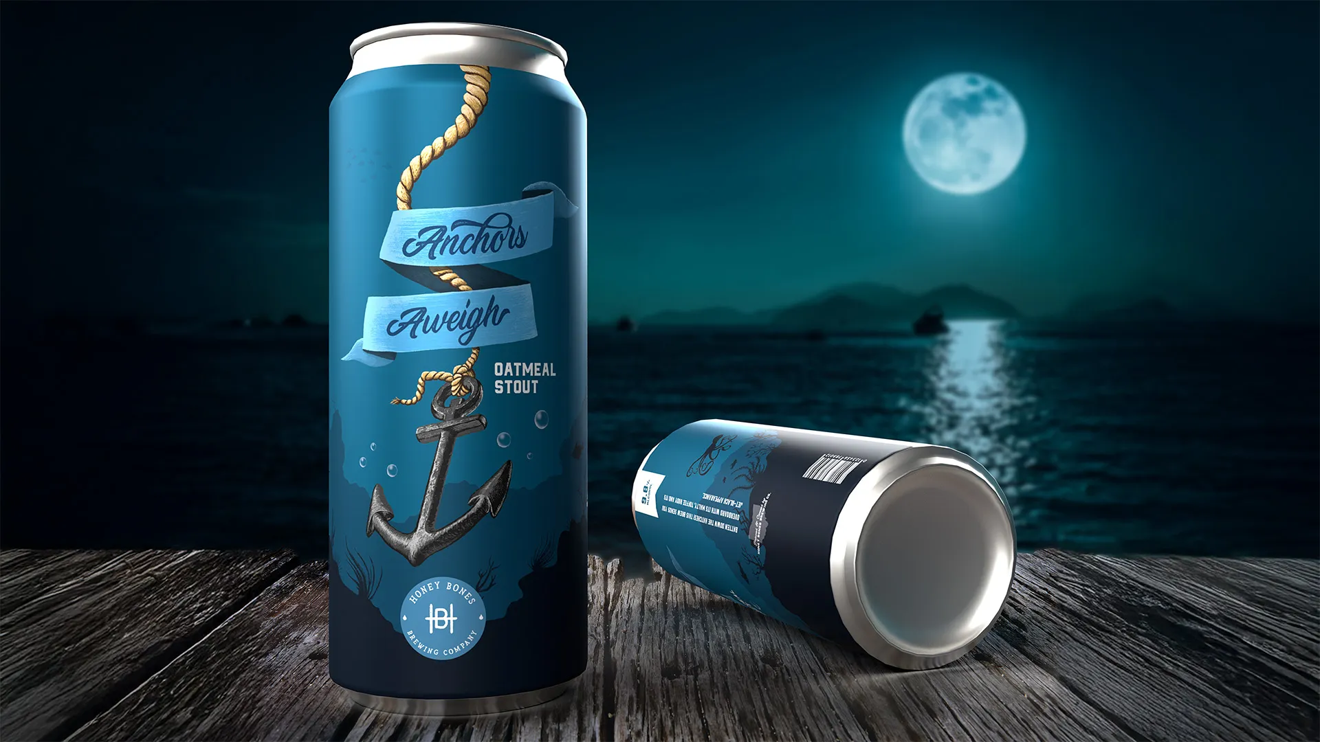
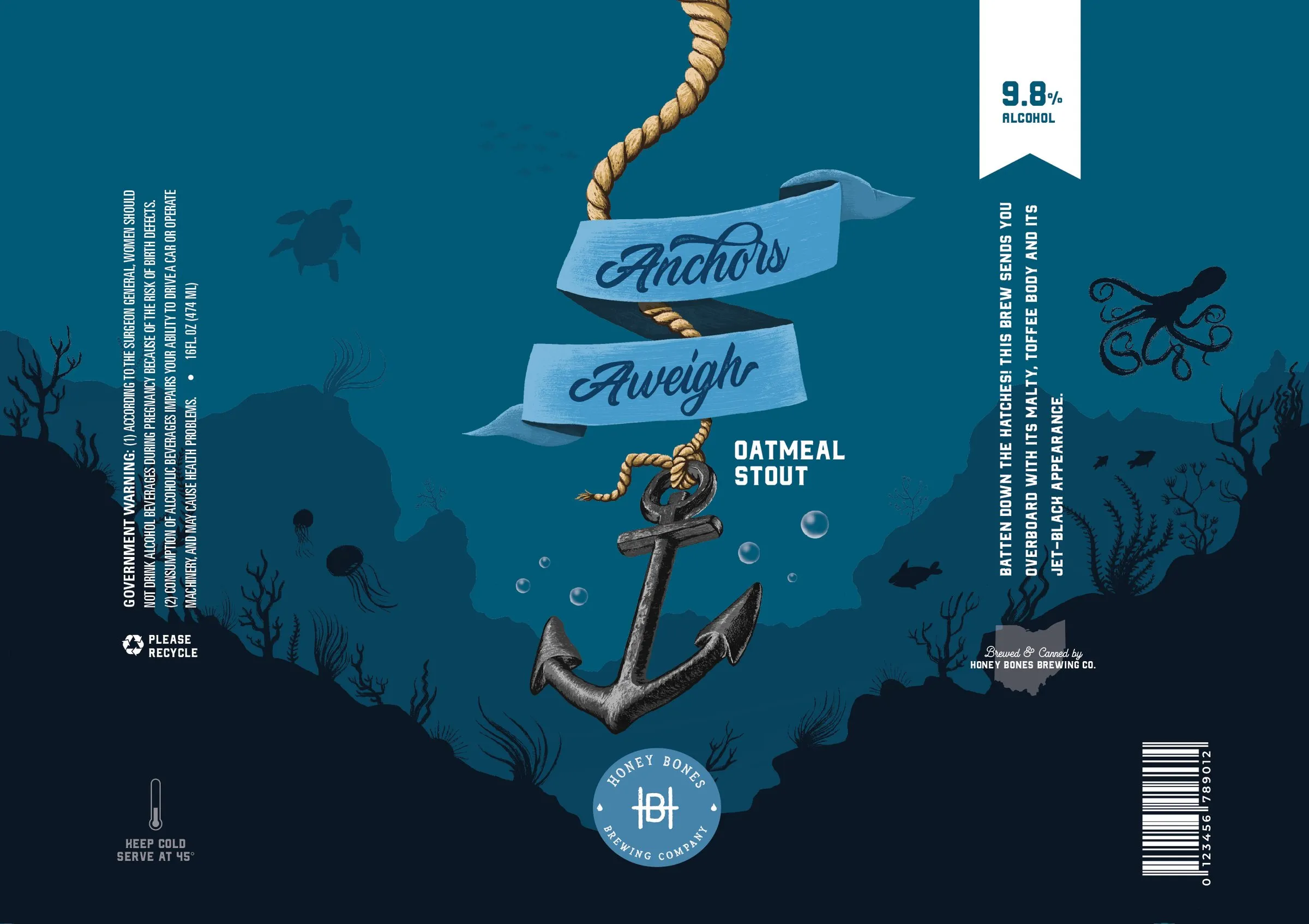
Each beer is a scene you step into, from a mango hot-air balloon to a bear reaching for a hive, wrapped around a shared monogram and type system. The project covered naming, identity, three full can designs, signage and the 3D mockups and turntable renders used to present it.
01 The brand
A brewery that never existed, built like one that did.
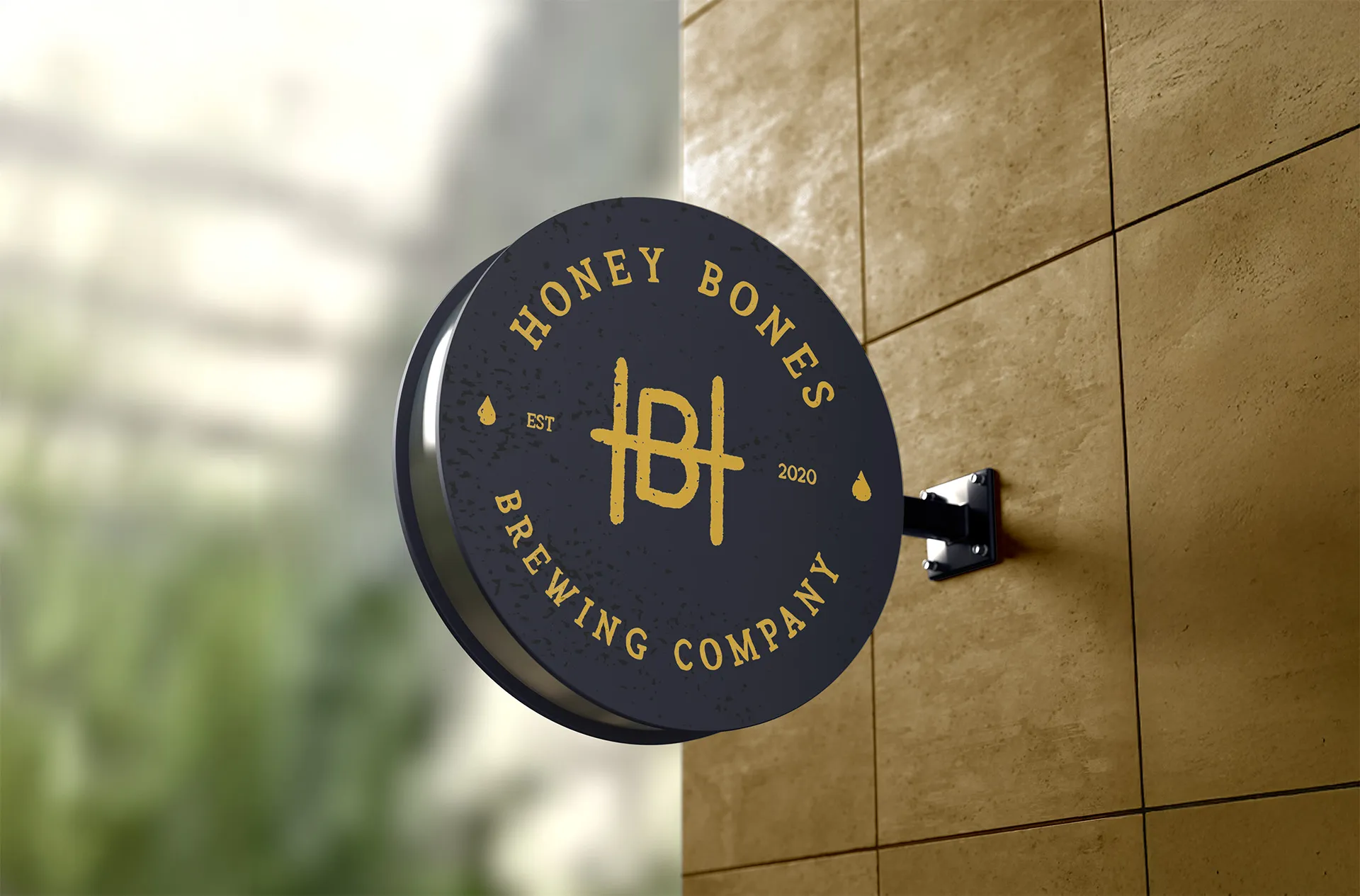
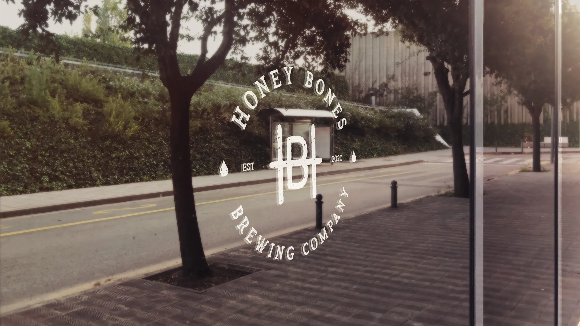
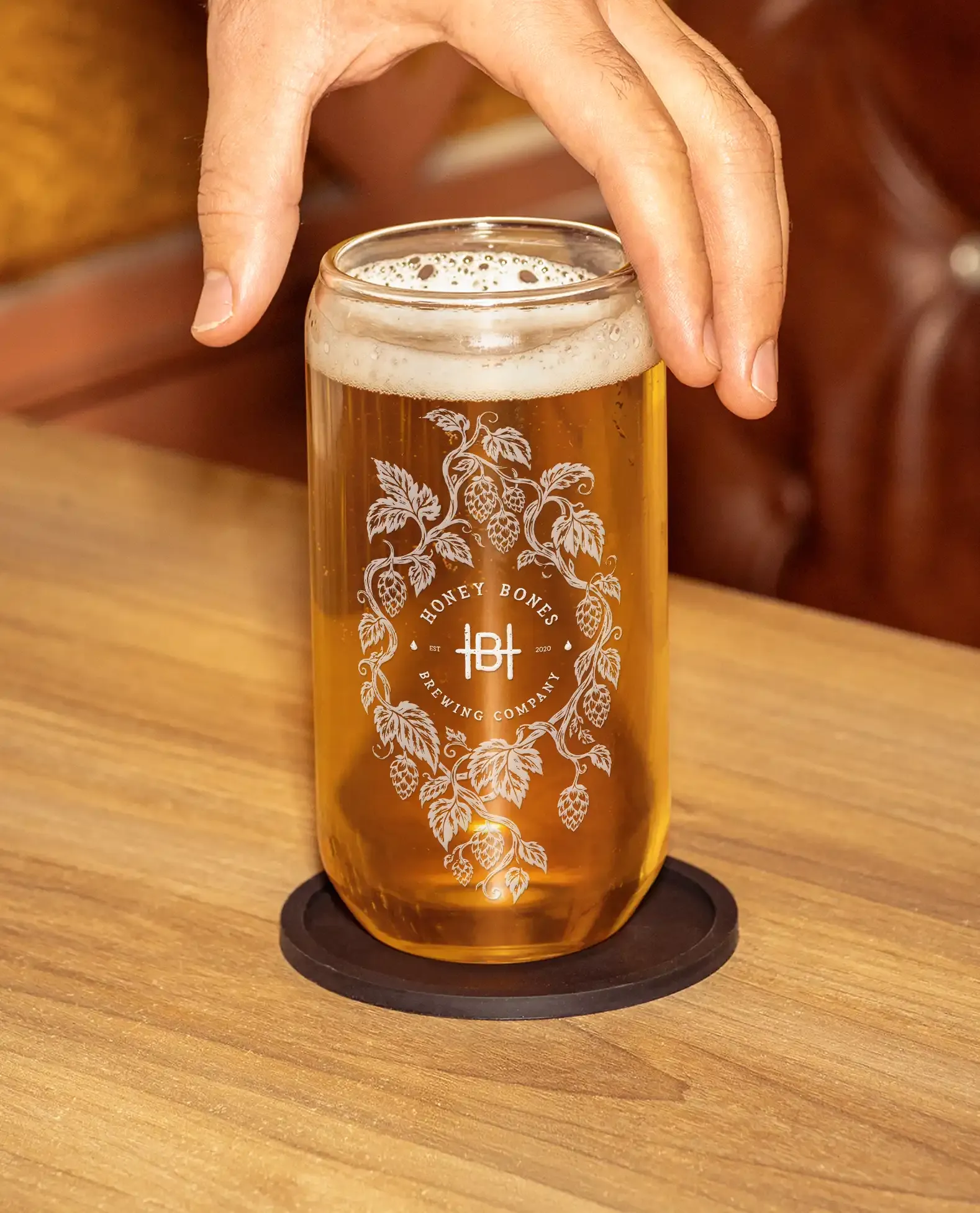
Honey Bones started with the mark: a roundel monogram where the H and B share a spine, set in a seal that works burned into wood, etched on glass or stamped on the bottom of a can. Everything else grew from it. The brand had to feel like it had been on the corner for years before the first beer was ever illustrated.
02 Sketches
Everything started on paper.
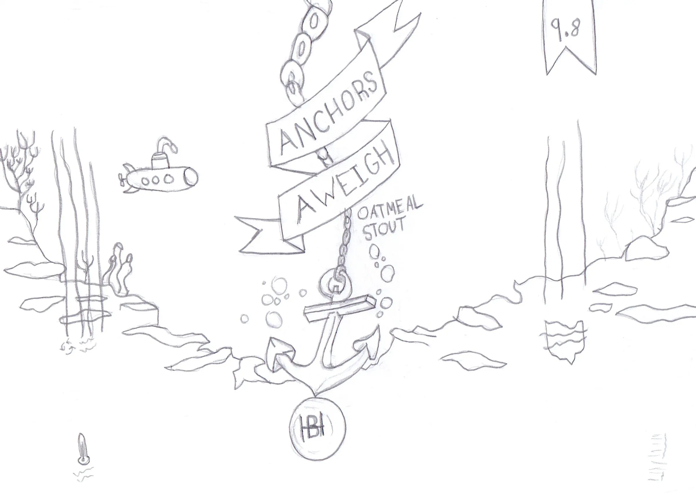
Each can was drawn by hand as a full wrap before anything went digital: where the scene breaks at the seam, where the type sits, where the monogram lands. The sketches settled the composition. The digital pass did the rest — the detail, the fully worked illustrations and the colour, everything you actually see on the can.
03 Can designs
Three beers, three worlds.
As the craft market grows, a can has about a second to stop someone. These stop people with a scene: a bear working a hive, a mango floating under a balloon, an anchor settling on the sea floor. Same layout every time, so the shelf still reads as one brewery.
Like the look of this? Let's make yours.
More work · 10 of 12



Farm Crawl
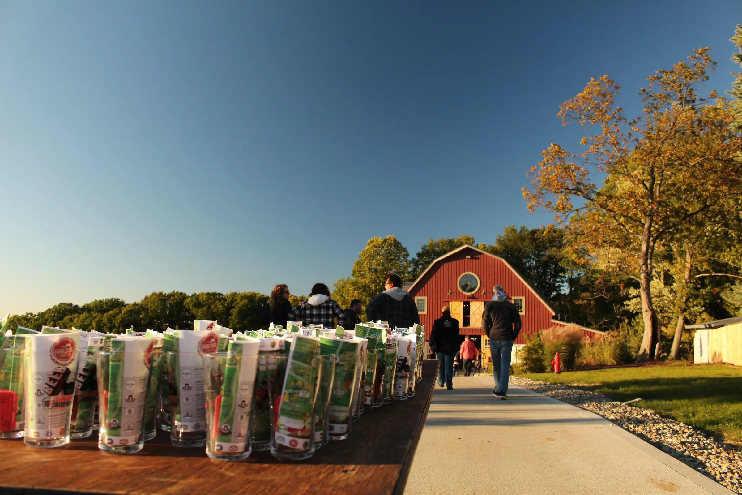
Fourteen breweries, one hundred acres, one night to find your way around.
- Branding
- Signage
- Apparel