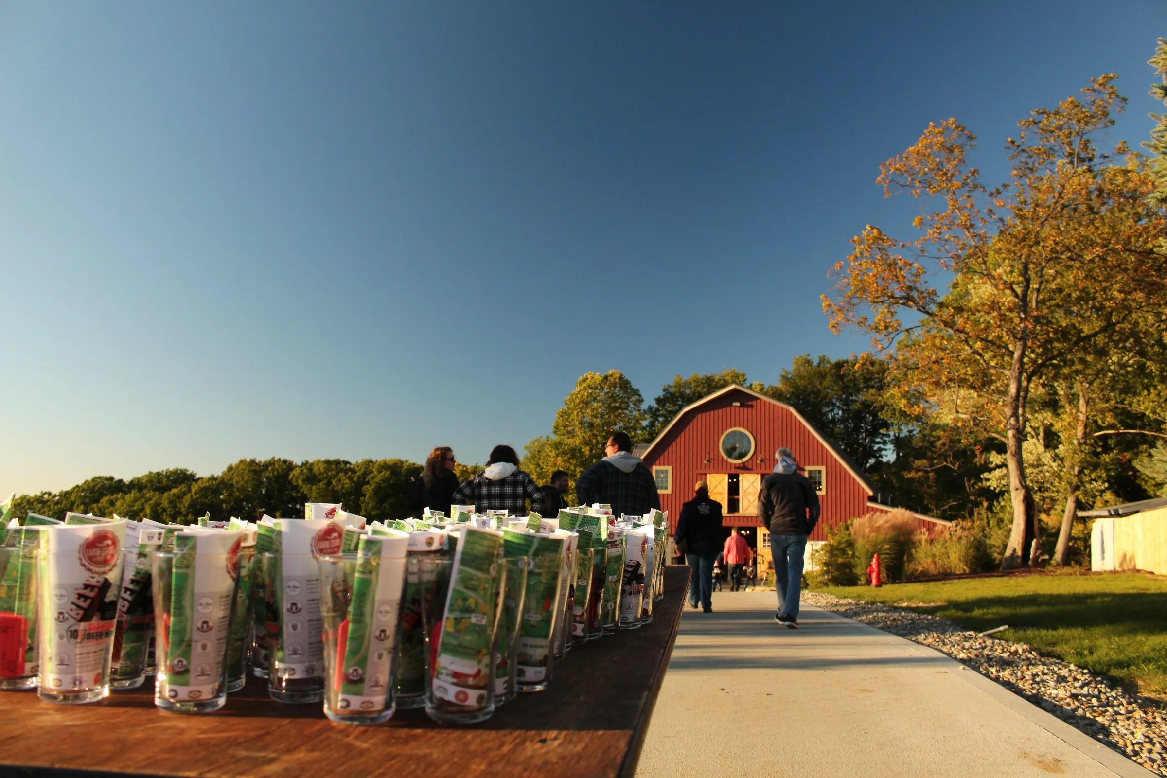
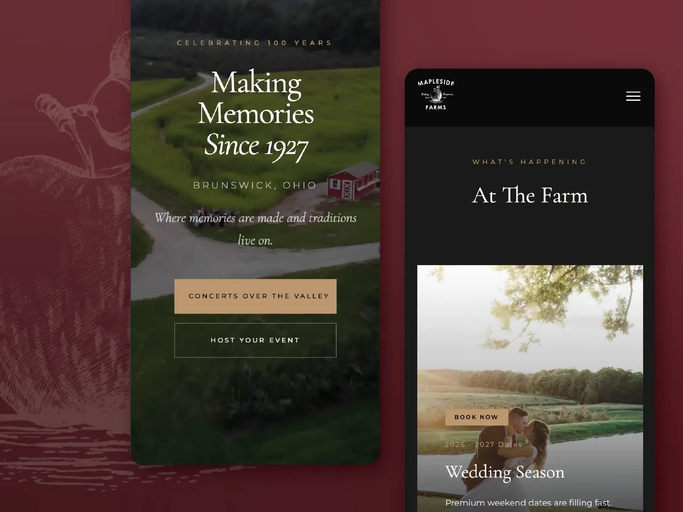
Mapleside Farms teamed up with Cleveland Beer Week to put fourteen breweries across a hundred-acre farm for one night.
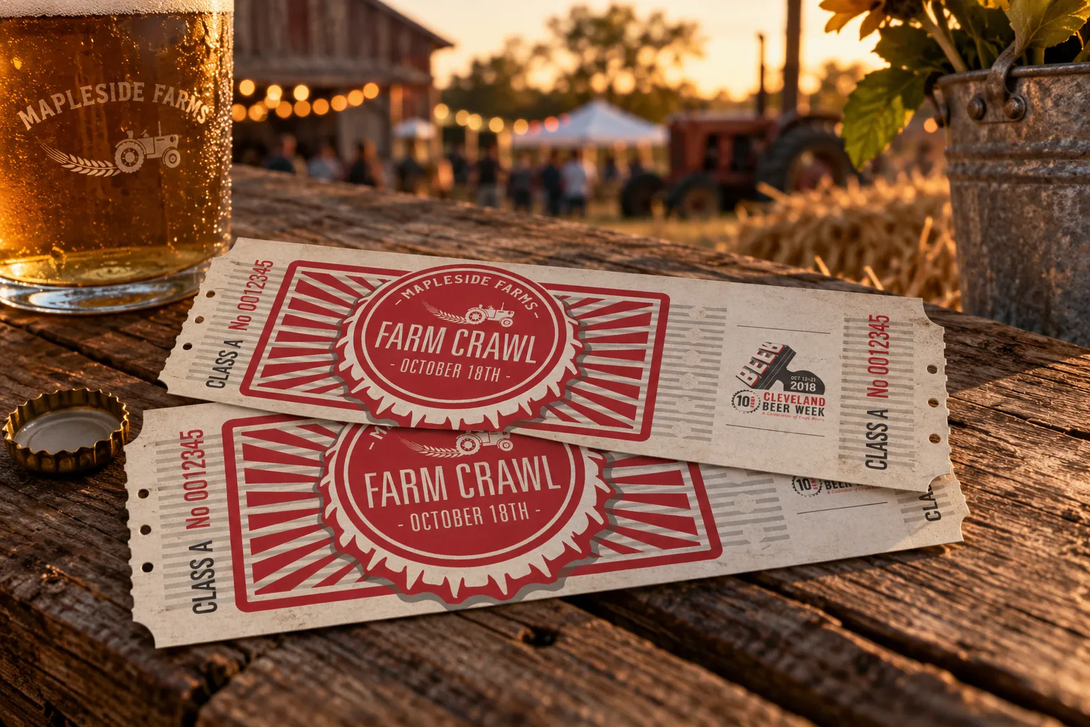
I built the event identity and then everything that had to live outdoors with it: station signage, tickets, game graphics, apparel and the promo that filled it.
01 Identity
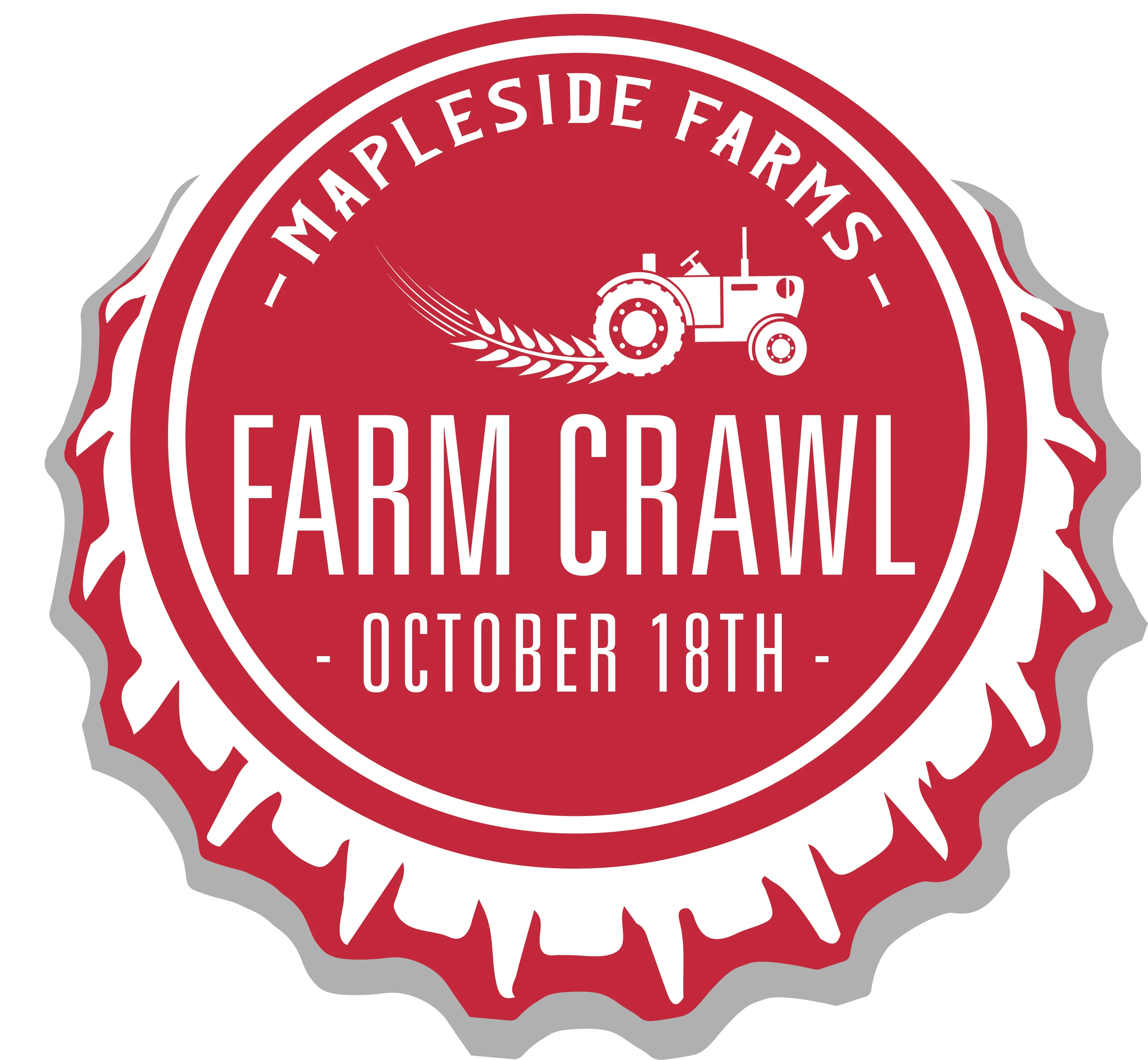
A bottle cap with a tractor in it.
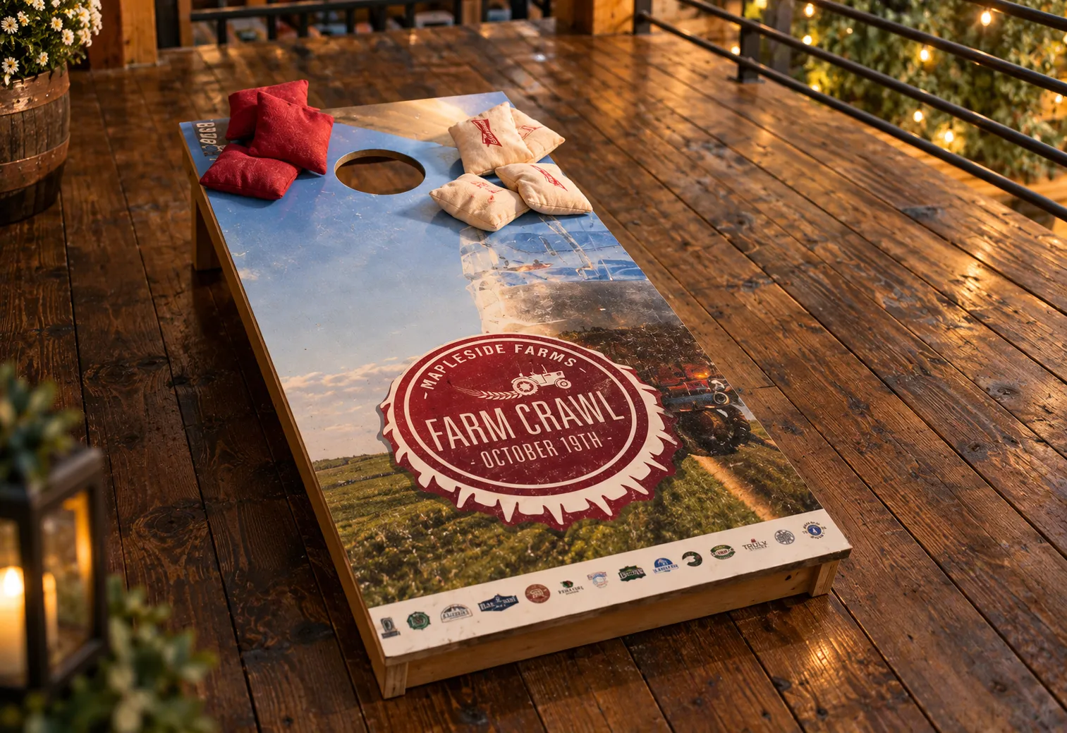
The brief was two words that don't usually share a logo: beer and farm. The mark settles it by building a bottle cap out of the farm — crimped edge, Mapleside's name curved along the top, a tractor where a brewery would put its crest. It prints in one colour, which is what you want when it's going on a ticket, a sign, a shirt and the side of a cornhole board.
02 On the farm
A hundred acres and no map.
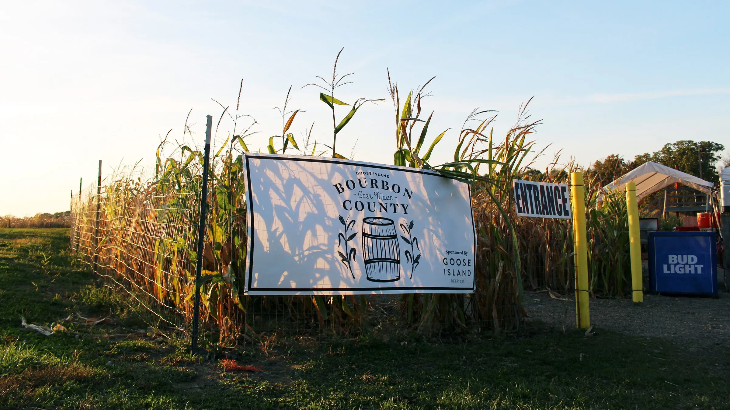
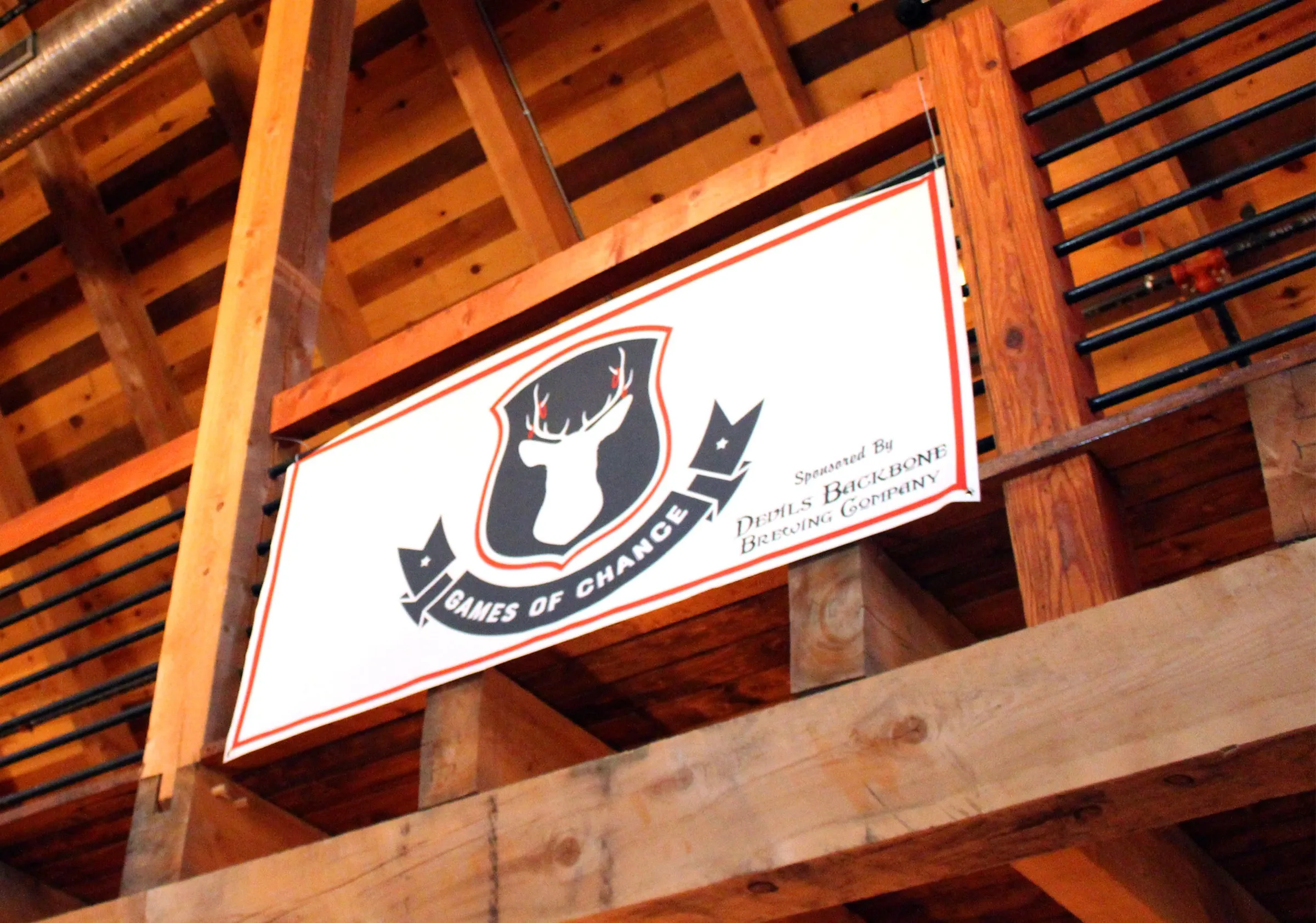
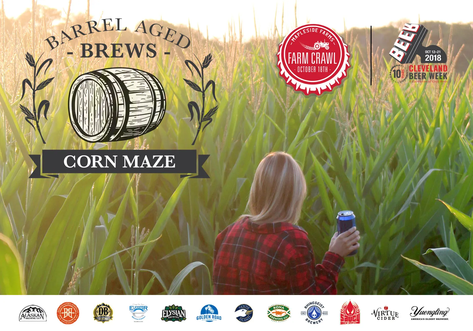
Hundreds of people, fourteen pouring stations and a working farm in the dark. Every activity got its own mark and its own sign so guests could navigate by looking up instead of asking someone: the barrel-aged corn maze, the games barn, the cornhole boards by the deck. Same red, same engraved line work, a different badge for every stop.
03 Beer Geeks
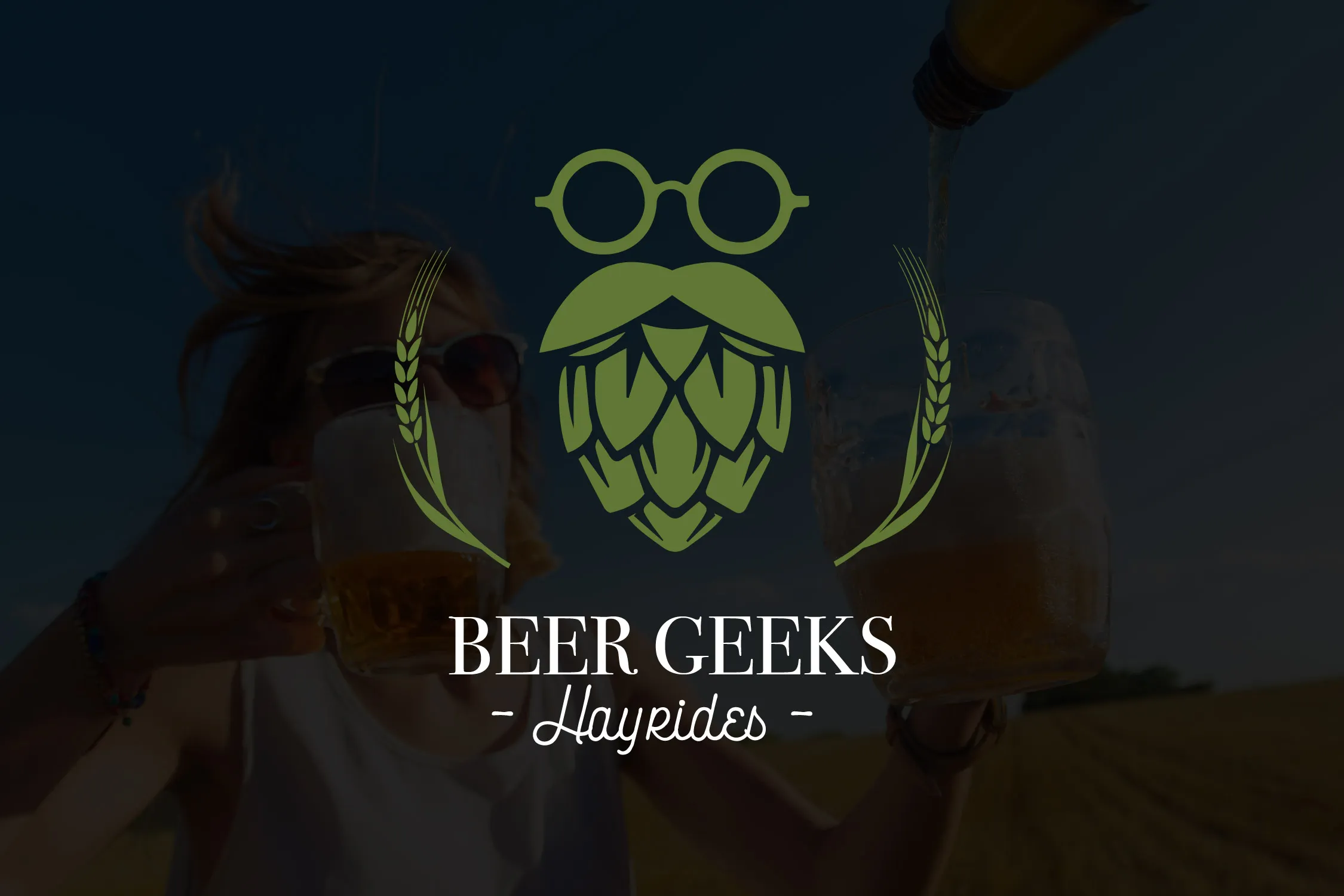
A sub-brand for the hayride.
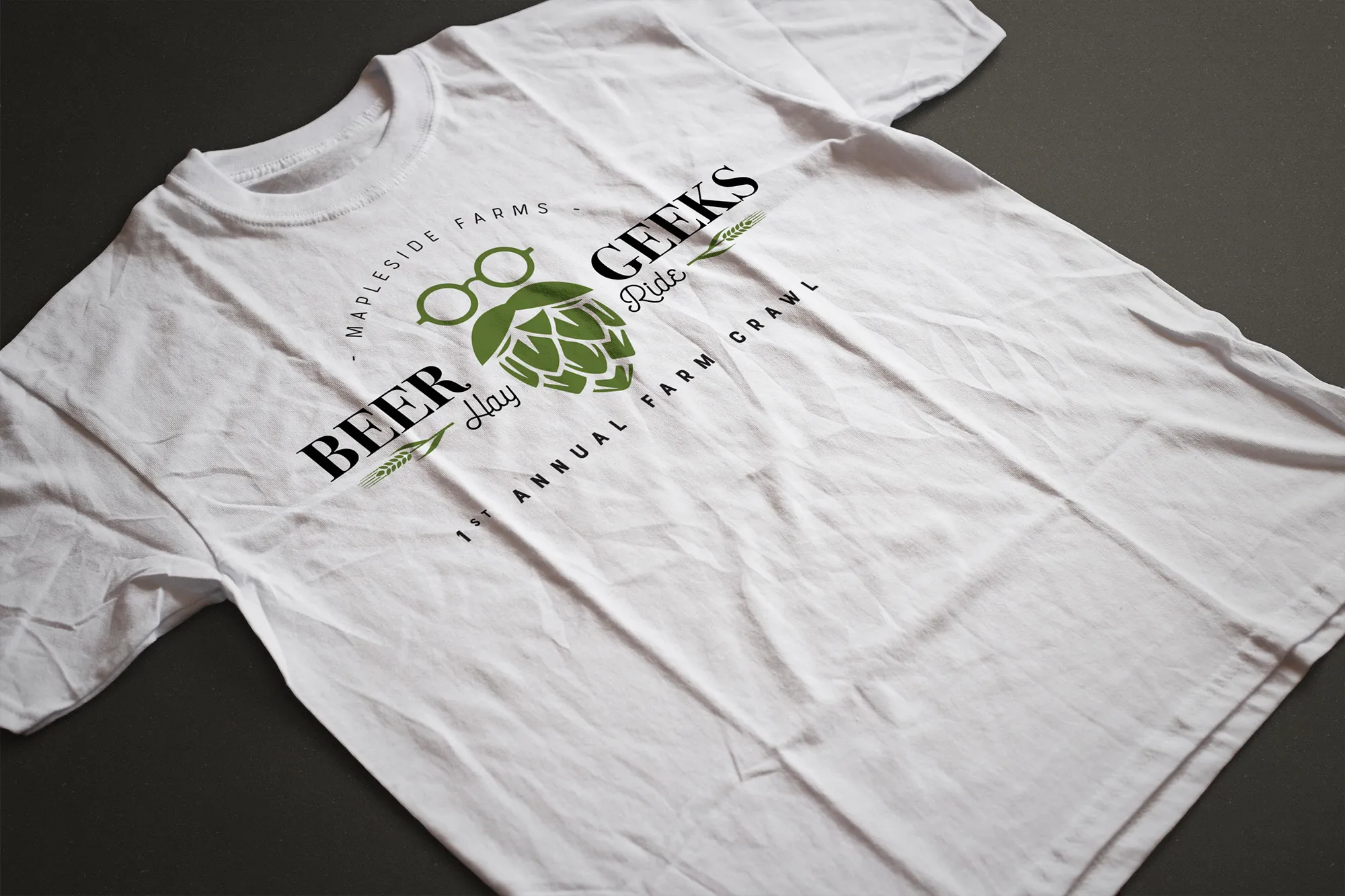
The hayride through the orchard needed its own name and its own face, so it got one. The mark is the beer geek everyone pictures — the IPA-loving, hipster connoisseur — built from a hop cone and a pair of geeky glasses, wheat either side, set in the same engraved style as the parent mark. It ended up on the shirts the crew wore all night, which is the real test of whether a mark holds up.
Mapleside Farms
“We've used Danny on multiple branding projects here on the farm and his talent and creativity has always exceeded our expectations.”

Like the look of this? Let's make yours.
More work · 11 of 12


Wine Your Way Thru
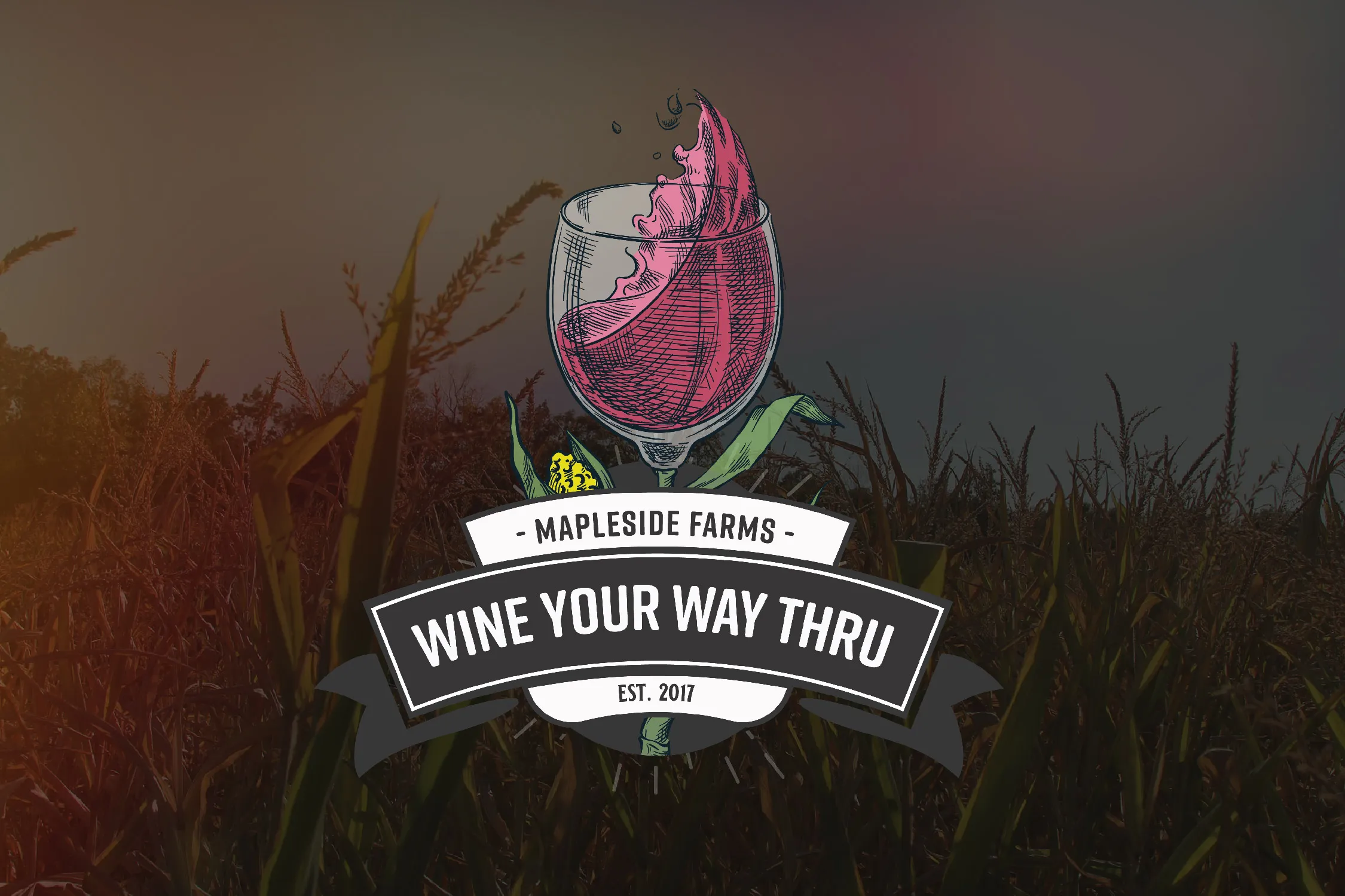
A wine walk through a corn maze, branded from the gate to the glass.
- Branding
- Signage
- Social